There’s nothing too serious or heavy in this first practical experiment, well that is if you don’t count the nature of the data I am looking at (more about this later). For this first set of practical tests I wanted to follow Tuftian design principles as best as I could, in terms of the ‘data to ink ratio’ – where any ink (or pixels in this case) that do not work to express the data is then a waste of ink (or, electric!!!). This being a perfectly logical concept, where the goal is to clearly and accurately display data sets so that the information can be deciphered quickly and unambiguously by the end user, is of course putting function firmly ahead of visual form. There is a good debate to be had about function vs. aesthetic in designing visualisations (for instance check out Illinsky and Steele’s Designing Data Visualizations book) where it is argued that aesthetically rich data visualisations can only have a very limited capacity to hold the data themselves, so are in fact data poor. The opposite is also implied and we should be comfortable in the distinctions between what we’d call an infographic – that is design rich and relatively labour intensive to produce – and a data visualization – where design is governed by predetermined algorithms that allow for complex and dynamic data.
My thinking is that all of this doesn’t have to mean that infographics and data visualizations need to be binary opposites. As I’m embarking on my PhD study right now I’ve reached a stage where I need to establish the terrain of current design methods and available technologies in data visualization. There are incredibly powerful software tools available (some commercially, some open source) that allow non-designers to create credible visualizations from rich data sets. My main interest right now is in (a) the contexts and situations in which these technologies are used/deployed and (b) the design principles that these technologies relate to.
I wanted to push the traditional X and Y axes graph a bit further in an attempt to plot a number of data attributes beyond the usual x and y relationship. To get the ball rolling I started with some data that I’ve been collecting for a while. Rather than using just any old data (and any old data is just a click away!) I wanted to gather my data sample about a subject that I have reasonable knowledge about. For as long as I can remember I have been fascinated by a particular era of military history (World War 2) and a campaign that was fought within it (the strategic air campaign against Germany). The amount of material effort that went into this campaign combined with the tragic amount of losses (on both sides) is astounding.
Anyway I have with the help of my better half been logging data from Bomber Command operations in World War 2: each individual mission flown, aircrew casualties, target destinations, departing airfields and more. The scale of the data is simply overwhelming so I have only been able to cover a 6 month period of the war in a reasonable amount of time. This in itself created several thousand data sets. Happy hours in Microsoft Excel!
My chief aim was to let the data speak for itself (that’s also the motto for this site). I wanted to see what stories the data could tell without approaching the visualization design with a pre-existing idea or bias in mind. My secondary aim was to try and include as much detailed information in the graph as possible without introducing clutter or ambiguity. My tertiary aim – for some of the designs – was to experiment with filtering or brushing out data to place emphasis on certain information and thus hiding the rest (kind of drilling down, although I can’t stand that term!)
The following examples were created in tableau professional. They are interactive and this helps facilitate the level of data detail I wanted to be in the graph. When you roll over areas of the graph you can see further detail about the data inside a contextual dialog box. Very hard or impossible to create in a static vis. You can also click a graph element to isolate it or click on a dataset in the key menu and use the pencil icon to ‘brush’ the other datasets away. Pretty neat.
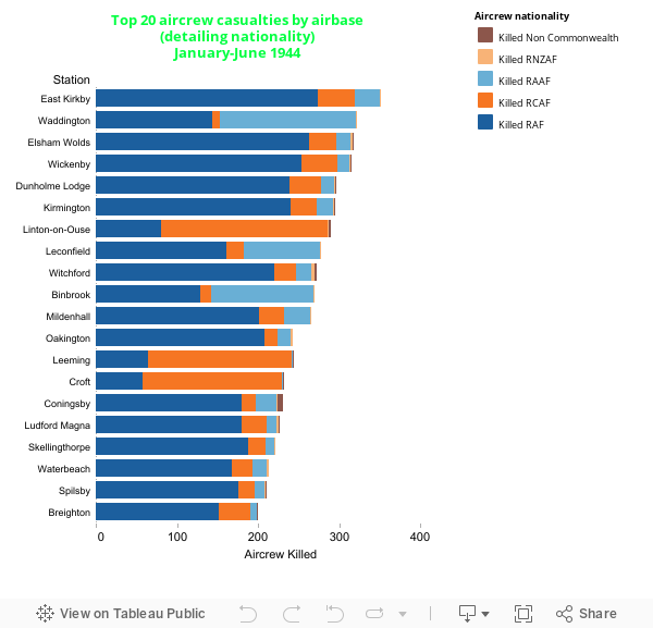
Fig. 1 Aircrew casualties by nationality and airbase
From this we see that the airbase RAF East Kirkby suffered the worst losses in the period (actually 351 airmen killed). We get the impression that in these top 20 losing airbases the RAF aircrew sustained the most casualties, however airbases such as RAF Leeming and RAF Croft sustained a higher ratio of Canadian aircrew casualties. What we should remember, and what this graph does not indicate, is that some RAF bases had 1 squadron and some had 2 squadrons, directly influencing the loss rate from that base
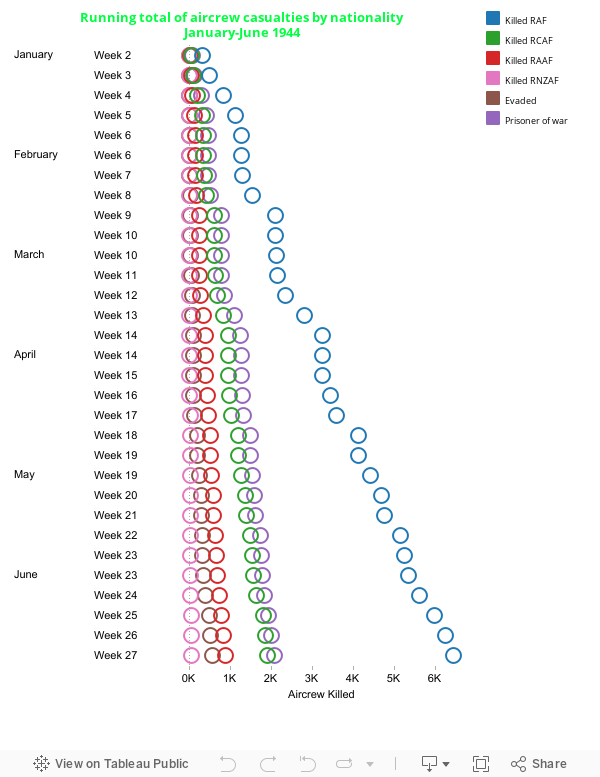
Fig. 2 Running total of aircrew casualties by nationality
It was evident from the graph that RAF fatalities far outweighed those of other nationalities in this period, totaling 6,459. There were more prisoners of war (combined nationalities) than any fatalities of other singular nationalities, going down the scale to Canadian and Australian fatalities, Evaders (of all nationalities) and then New Zealander fatalities.
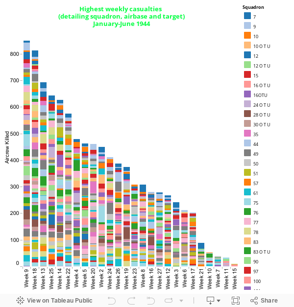
Fig. 3 Highest weekly casualties (detailing squadron, airbase and target)
The weeks here are ranked by heaviest losses in week. This would have been pretty straightforward but then I decided to push the detail as much as possible using colour and contextual dialog box. Colour is used to delineate each squadron but this hasn’t worked so well since there are nearly 100 squadrons involved. However the target and departing airbase help to give a picture of what constituted the casualties of that week.
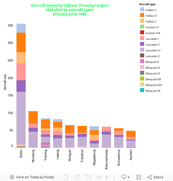
Fig. 4 Aircraft losses by highest 10 losing targets (detailed by aircraft type)
Aside from the significant outlier (Berlin, which has adjusted the scale of the other values accordingly) the colour delineation becomes more functionally successful than in fig. 3. We see that the Lancaster aircraft of various models accounts for the most aircraft type lost.
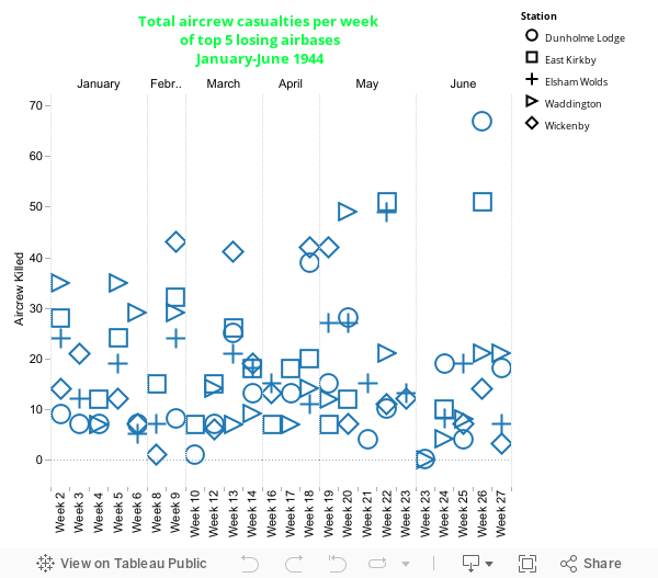
Fig. 5 Total aircrew casualties per week of top 5 losing bases
Here we can see how each of the top 5 losing bases compares for losses in each week. The scatter plot format allows a relative picture of the values to be seen however there are some severe areas of clutter at points in the graph. This format becomes most striking when there is an outlier, in this case RAF Dunholme Lodge having 67 casualties in week 26. Tableau’s brushing feature is useful here because it allows visual salience to be placed on a data set at the users discretion. However, with all this in mind it would have probably been better to use a line graph for this time-series data.
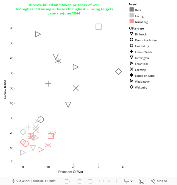
Fig. 6 Aircrew killed and taken prisoner of war for highest 10 losing airbases to highest 3 losing targets
Here the scatter plot format comes into its own because this graph is for relative and not time series data. To avoid the same issue of cluttering as in fig. 5 however the included values have been heavily filtered out to show only the top few (10 airbases to 3 targets). Colour has also been introduced to further delineate the target sets. Here the outliers are extremely noticeable again, notably missions from RAF East Kirkby to Berlin sustaining 91 fatalities and 30 prisoners of war in the period.
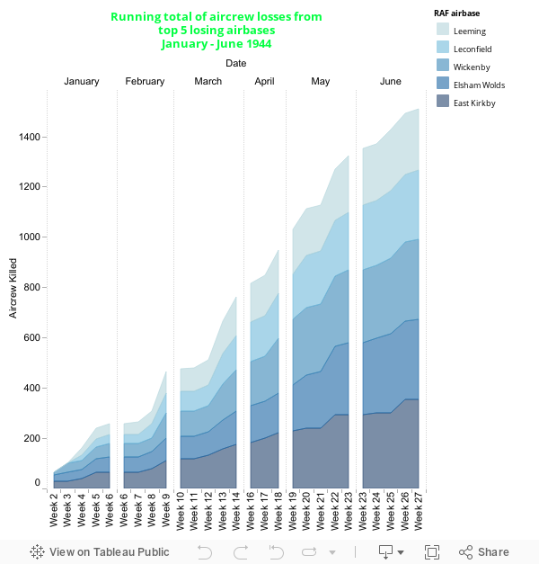
Fig. 7 Running total of Aircrew losses from top 5 losing airbases
The last in this series of experiments, this is a hybrid of an area and bar chart that is also a time series graph! The values were filtered to show the top 5 of a category. From this it seems that each airbase sustained roughly the same losses in the period, however this could be a fallacy of representing data by area because there is a difference of 110 fatalities between RAF East Kirkby and RAF Leeming – that is denoted on the rollover contextual dialog box!
And so ends this series of experiments. If anything else it has been the first application of my hard earned Tableau software experience and is certainly a work in progress. What’s most apparent is that the data is beginning to tell the story – albeit it in a rather fragmented way now. Much more work along these lines will no doubt unearth surprising stories about this memorable time in history. But much more work in data collection and visualisation methods will need to be done. What design can learn from and contribute to data-led storytelling is the crucial thing.