Recently I’ve been thinking about how storytelling and data visualisation relate. There’s increased attention to storytelling in the data visualisation scene: Tapestry, the first conference specifically about storytelling in data visualisation, took place in February. The Guardian and New York times, among many other great quality newspapers, continue to make innovative work aimed at storytelling primarily through data visualisation; and recently noteworthy is Robert Kosara and Jock Mackinlay’s paper entitled ‘Storytelling: The Next Step for Visualisation‘.
Part of my work is digging a little further into what storytelling is or could be in this area, what people who are doing it may assume and how stories through data come across to a reader or viewer.
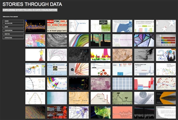
For this I’ve been developing a new corpus analysis website about storytelling in data visualization (pic above) – where I’m trying to work out some ways of measuring and judging storytelling approaches that seem to be used across a wide range of current data visualizations (more on how this is going further down).
There is a precedent for investigation into this area. Segel and Heer produced a paper some time ago, entitled ‘Narrative Visualisation: Telling Stories With Data’, that focused a lot on physical/interactive facilities of data visualisations and how they impact narrative. That paper moved to classify visualisations into ‘genres’ of designs (like ‘annotated graphs’ and ‘comic strips’) and relate those to a matrix of design ‘tactics’ (like ‘zooming’ and ‘filtering’ on data). What Segel and Heer did was to analyse case studies of data visualisations and that helped them identify some trends between said ‘genres’ and ‘tactics’. Their way of thinking seemed to open up intriguing possibilities for design and technology shaping narrative exposition in data visualisation; but I felt the approach alone could result in a technologically determined and potentially limiting way of thinking about the relationship between storytelling and data visualisation. Asking how data visualisation affects storytelling begs the reverse question too – and my approach is to ask what storytelling can bring to data visualisation; in what way can practice make most benefit of this communicative act?
I’ve taken some cues from narratology in trying to get an answer to this question. Looking further into the narratology literature, narrative can on the one hand be broken down into a set of universal laws and principles that may transcend mediums. Stories have temporality in common (they deal with time) as well as causation (they deal with cause and effect of something). On the other hand there are the more media specific narrative affordances as for example in the way that film, opera, novel and data visualisation – because of their physicality and the dimensions open to them – would be able to give a different ‘staging’ of a story.
However, if we assume that there are some fundamental properties of narrative that cross media – like structuralist theorists (e.g. Barthes, Genette) did in their move to establish some general laws and principles around narrative – then it would be interesting to see the extent data visualisations accord to such a conception. What we are talking about here are general principles in narrative such as narrative voice (who is speaking and where from?), the order of events, causation, suspense, closure and the like.
The fact that there are data visualisations that don’t really have beginnings or endings (or, more intriguingly those that make many potential beginnings and endings available) indicates that my attempt to reconcile storytelling through data visualisation with literary narrative approaches will be frustrated. But I’m not disheartened by this because if discovering that narrative data visualisations don’t relate very much to traditional modes and methods of storytelling, then this in itself is something learned!
Thinking about the second conception mentioned above – the storytelling affordances that data visualisation brings as a medium – a pursuit of this could be to find out what, if anything, data visualisation brings anew to storytelling that can’t easily (or at all) be achieved in the same way elsewhere. Kosara and Mckinlay touch on affordances in the earlier mentioned paper, relating to medium specific features that can provide narrative structure. In visualisation the most obvious affordance would seem to me to be around tapping into innate human abilities for visual perception, to make sense of complexity with relatively little cognitive load. Although this invites the question of authorship and intention when we imagine the wielding about of huge datasets to which plausibly can invite impressionistic and shallow readings (or, more positively, serve to give an interesting and compelling starting point). As well as this we could add user interaction and collaborative visualisation as distinct data visualisation affordances that come to bear upon storytelling. But such novelties can also be imagined to complicate the telling of a story – as for example if you interact with a storyline by selecting and manipulating the constituent data, to what extent does your agency change the narrative and work against the possibility of telling a cohesive story.
So it seems this is a multi-faceted problem. I wanted to get some ground rules for storytelling (whilst keeping in mind the perils of being reductive and simplistic) – so setting off by reviewing the most prominent literature on narratology helped – but it must be acknowledged most of narratology seems to prefer literary forms of narrative as its subject. Whether or not modes of storytelling employed in literary fiction have much bearing for data visualisation is something to reconcile in itself.
Nevertheless the business of narratology is in defining the very nature of ‘narrativity’ – or, what is it in a text that ‘tells the story?’ This is a complex and problematic topic where it can be seen, rightly, that there are very different conceptions about what constitutes narrative. There are those that advocate general narrative laws and principles as being transferable between mediums and contexts, there are those that reject tendencies to generalise about narrative structure, who see narrative instead as much more of a contingent and indeterminate thing.
Starting with traditional narrative conceptions, I set about defining some parameters with which to build a narrative analysis framework. In my reading for this I found recurring aspects of narrative called into reference, such as Genre definitions; whether or not there is a narrator and from what perspective the narratorial voice comes from; the extent that story time compares to telling time; the extent that human sensation or feeling is expressed; or the way that events are ordered in time, and so on. All of these things can be called into question when thinking about how a particular story is being told. I found the narrative parameters I collected were many and varied, so straight away devised five high level categories with which to begin:
- Genre – Describes the ‘canon’ of story that the sample may belong to.
- Mode – Describes ways in which voice may be used for story exposition.
- Composition – Describes ways in which events may have been ordered.
- Emotion – Describes ways in which the narrative may describe or evoke human emotion.
- Interaction – Describes possibilities for non linear and interactive ways of experiencing stories
The above higher level categories led me to forming this initial framework for analysing storytelling in visualisation – where you can see a number of low level factors I am taking into account. Yet because I wasn’t at all expecting narrative in data visualisation to always parallel closely with traditional narrative structuring, I thought it prudent as well to consider a wider conception of narrative – i.e. going beyond established literary/text based narrative approaches. I intended to look beyond the neat notion of story as a convenient way to package and comprehend, simply put: where things are not so black and white! This led me to considering indeterminate and emergent forms of narrative, where the story depends to some extent on what the ‘reader’ does, or how patient they are when story is elusive.
All of these storytelling modes and methods I took into account when gathering together and analysing a corpus of data visualisations. You can see how this is developing on that site especially created for this task, put together with great thanks to Carl Tawn for his help on this, a gifted developer and without his skills it would never have got past the technical boundaries to get operational.
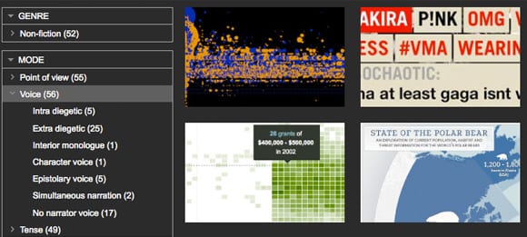
Up until now 50 data visualisations of diverse origins and approaches have been put into that corpus and analysed according to my initial framework. Playing around on the corpus site allows you to filter and group the storytelling aspects (example image above) and see what approaches are more or less common. This is not (yet) a very scientific approach but with all the broad problems and conceptions of storytelling and data visualisation as I see them, then necessarily my starting point for gathering and analysing the work is broad too. In the spirit of visualising data I then created some visualisation from my research data that comes out of the corpus analysis as it presently stands. See below…
Graph 1: Primary Analysis Purpose, Utility, Display Context and Media Type. Interesting that from the samples analysed to date this indicates a fair split between the exploratory and explanatory kind of visualisations, as well as a number that are somewhere in-between both poles.
Notes:
1. Primary analysis purpose (i.e. what the visualisation is primarily trying to represent);
2. Utility (i.e. whether the vis attempts to explain the phenomena or allow you to explore it, somewhere in-between or neither);
3. Media type (i.e. in what physical format does the vis appear)
4. Display Context (i.e. what ‘area’ does the vis appear in)
Graph 2 (below): This graph details the narrator point of view (i.e. the person perspective) that I found each visualisation took (including those that seemed to have no narrator point of view too). Interesting to note that from the samples so far analysed, Most fall into the third person perspective narrator, or no narrator voice.
Graph 3 (below): This graph details the kind of voice employed in the telling of each story (i.e. whether inside or outside the text, or reported speech). Also detailed are cases having no apparent narrator voice. Interesting to note that from the samples analysed to date most have either an ‘extra diegetic’ narrator voice (the voice is coming from outside the story) – or no narrator voice.
This is exactly where my investigation into storytelling through data visualisation is at now. Next on my list is to further analyse my research data to detect where any gaps, patterns (and of course errors!) exist and can move knowledge onwards (another post).
In ‘Storytelling: The Next Step for Visualisation‘ Kosara and McKinlay neatly ‘…define a story as an ordered sequence of steps, with a clearly defined path through it’ and base their ‘working model for how stories are constructed […] on the way journalists work.’ – which makes sense in light that most data led visual storytelling appears to come from journalism, where we may assume for the most part that journalists are seeking to present facts in a balanced and logical way to come to a point. In that way the journalist as story creator acts as interface between reader and source data – curating and crafting its presentation so ‘Most of the source material only serves as the raw material for the written piece’ – in order that the reader experiences an uncluttered and coherent story in a timely (and presumably enjoyable) way.
But their working model is only one approach to storytelling through data visualisation, predicated as it seems to be that things ought to have structure and make sense. To me stories don’t always seem that neat. Another approach could acknowledge possible creative affordances of storytelling (that could also be problematic, in terms of communication) – but nonetheless engaging. Story can be a very emotive and immersive way of recounting events but one that doesn’t always necessarily have to make sense. What if, for example, we conceived of story as contingent upon the participation of the reader, or as representation of events not necessarily always having causation or closure?
There are other – at least as engaging – possibilities to visualise data that veer away from purposes of efficiently making sense of and coming to terms with complexity. And if we consider that storytelling is a ‘messy’ concept and factor in that storytelling raises questions around authorship and agency, it then seems more problematic (but nonetheless intriguing) to reconcile storytelling with visualising data.
So, can you see a story? Plausibly yes, but for data visualisation it seems this depends whether you want or expect to be given a beginning and ending, and how much effort you’re prepared to put into reading (or even, making) the story. To conclude this post I want to bring in a couple of brief thoughts:
‘Tools have no stories to them. Tools can reveal stories, help us tell stories, but they are neither the story itself nor the storyteller.’
‘Does the world really present itself to perception in the form of well-made stories, with central subjects, proper beginnings, middles and ends, and a coherence that permits us to see “the end” in every beginning?
‘Sometimes I don’t want to have to do the work. Sometimes I want someone to read to me while I relax.’
Samyn, M (2008) The Challenge of Non Linearity, (quote from commentariat)
‘Once upon a time there was ___. Every day, ___. One day ___. Because of that, ___. Because of that, ___. Until finally ___.’
Cyriaque Lamar, The 22 rules of storytelling, according to Pixar
‘[Narrative is] a basic human strategy for coming to terms with time, process, and change’
Herman et al, 2005:ix, The Routledge Encyclopedia of Narrative, Routledge, 2007
—–
Comments welcomed. Until next time, thanks for reading.
Chris.
[…] tweet ultime : texte + photo + audio (PBS), Visualisation de données : pouvez-vous voir l’histoire? (Stories Through Data), 5 types d’outils de curation pour journalistes (journalism), Wikiworld: […]
I really like that this classification includes both spatial and linguistic aspects of information.
This classification characterizes the *how* of a dataviz piece. I would love to see included here a discussion of how the *why* of the piece helps shape the design decisions for the *how* of the piece.
The category above called ‘Purpose’ is describing facets of *how* — the form the information takes, the way the information behaves (e.g., “part to whole relations”). The ‘Purpose’ category doesn’t capture the *why*. Why would I want to make part to whole relations? In what context? What is the designer/audience attempting to accomplish?
If that why part is clarified, it serves as a litmus test to decide if (& then how) to include narrative in the variety of forms characterized here. It removes the argument that I need to be “pro” or “con” narrative. I map that design decision back to a clearly stated design problem and ask, “does narrative help solve this?” If yes, “what kind of narrative solves my specific situation, nature of my data, etc.?” This places storytelling/narrative as another design tool in the tool box to be used as situation suggests.
I would love to see included in the proposed Framework for Analyzing Storytelling in Visualization a discussion on considering how well the chosen linguistic/spatial forms of information that appear in a given piece map back to the *why* of the piece. That discussion depends on context/audience/content for each piece and is tough to generalize (though there are ways to abstract it and spot patterns at a higher level. For example, http://www.slideshare.net/kaarinh/using-abstraction-to-increase-clarity ).
Hi Marsha,
Thanks for your comment, and yes I agree that the *why* needs to be a logical next step. One thing I’m aiming to do, after I’ve classified a lot more samples, is to look for patterns or gaps say in the use of specific visualisation approaches (say part to whole relations, network etc) and why that might/not best relate to a story type.