Bomber Command memorial launch – House of Commons, London
I worked on data visualisations for an exhibition in the House of Commons, London. The exhibition relates to a memorial to the aircrew of RAF Bomber Command who gave their lives in World War Two, which was built in Green Park, London, and opened in 2012.

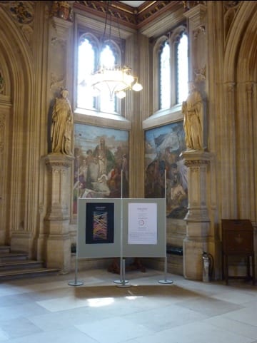
One of several panels included in the exhibition
This is a project of great personal interest to me and one that contains an extraordinary amount of data, and pertinent to the area in which I live and work, Lincoln. A great deal of this military campaign was fought from the area known as ‘Bomber County’, as well as from parts of Yorkshire and Cambridgeshire.
In this work I aim to give an essence of the magnitude, effort and sacrifice involved in the Bomber Command campaign, by communicating aspects of it through data visualisation.
Below you can see seven panels which were displayed as part of this exhibition. The panels are printed in large format and are displayed with other artefacts and information panels.
Sebastian Cox, head of the Air Historical Branch of the RAF, describes the exhibition: ‘This small exhibition is designed, using text, photographs, paintings and exhibits, to illustrate the sacrifice and achievements of RAF Bomber Command throughout the six years of the Second World War. It highlights the sacrifice of the 55573 airmen who died and their considerable contribution to the defeat of Hitler and the Nazi state. A section of the exhibition, incorporating artist’s impressions, drawings and an architect’s model, illustrates the plans for the Memorial being erected in The Green Park.” Additionally: the exhibition has been put together by the Bomber Command Association and will include an architect’s model and illustrations of the commemorative memorial scheduled to open in Green Park this summer. The display will illustrate the history of Bomber Command and its role during the Second World War by using information panels, photographs and exhibits, including a bombsight, aircrew logbook, flak maps and targeting material.’
Perhaps one of the most rewarding and emotional aspects of being involved was to see veterans of Bomber Command at the reception in Westminster today, who are now at a very old age. It’s virtually impossible to appreciate what it would have taken for these people to carry out their work, and this data can only at best only give us an impression of what being a world war two bomber crew entailed.
The location of the exhibition is near to the MP’s waiting chamber in the House of Commons.
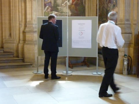
Exhibition view inside the Members of Parliament waiting chamber.
View of several panels that were included in the exhibition.


It’s a delight to be part of this work which in two ways is close to my heart, through both the historical aspect of this military campaign and by telling stories through data.
On another sweltering hot day in June 2012 many of the remaining war veterans gathered for the opening of a memorial to the Bomber Command in Green Park, to which the above exhibition and data visualisations related. A few pictures from a very atmospheric event…

World war 2 Bomber Command veterans in Green Park

Impeccably dressed men and women of the Royal Air Force

The Queen arriving

The Lancaster bomber dropping tens of thousands of Red paper poppies

One of the poppies
Full coverage went out of this event on the BBC News
————–
The Hardest Target – visualisation and storytelling project for the Lincolnshire Aviation Heritage Centre
This is the first in a series of posts where I’ll be making experimental data visualisations for a project I’m involved in – ‘The Hardest Target’. It’s based around historic military data and tells a story about the efforts of RAF Bomber Command in World War 2.
The eventual outcome will be a short moving image and/or interactive data visualisation piece about this military campaign and especially a mission that sustained one of the highest casualty rates of the war. Nearly 1/3rd of the participants in this mission were lost in action one night in June 1944.
I’m very happy to be developing this project for eventual display at the Lincolnshire Aviation Heritage Centre, East Kirkby. Positioned on one of the former RAF Bomber Command airfields where this mission was flown from, home to 57 and 630 Squadrons, the Centre exists to tell the story of the Bomber Command campaign and the 55,573 aircrews who were lost over the war. It’s the only place on earth you can sit inside a live and moving Lancaster bomber and experience the atmosphere of a living wartime Bomber Command airfield.
I’ve been researching into this aspect of military history behind which there’s literally masses of very complex data. Acquiring, processing and understanding this data has been my main focus over the past year – involving lots of visits to the National Archives, RAF Museum and taking in specialist military/historical literature.
Right now I’m testing out ways to visualise and create meaning from this data. Through practical experiments I’ll be looking at chart types, mapping, visual styles, interactive data visualisation and moving image data visualisation – all the while considering the editorial approach in developing a storyline as well as considering how to judge visualisation success.
First up then: an interactive vis that details the aircrews and aircraft lost from RAF East Kirkby, searchable by crew name and aircraft serial with a filter on the 10 targets sustaining the most losses from this base.
Thoughts:
This visualisation was made in Tableau which is straightforward enough to use once you understand a bit about creating dashboards and filter functions. The visualisation taken by itself is more of a resource perhaps than for enabling storytelling. Maybe this depends on the context in which it’s placed. If say you were a historian or a relative of one of the aircrew based at this station it would prove handy to be able to see details about the losses. Another aspect would be in its site specificity – so as a visitor to East Kirkby this piece would give you an overall impression of the scale and distances involved in operations from the airbase – where you would be standing.
My first feelings are that this visualisation is straightforward to use because I’ve limited its scope to a simple (but big) data set. Being able to see the overview then select and filter down on different details soon makes this big dataset easier to handle. I think one of the drawbacks of Tableau Dashboards really is in the visual execution which is quite basic and clunky. This is where I need to achieve a balance in form and function and its difficult – understandably – in tableau to create anything that doesn’t appear default. That said, it’s power to wrangle and edit big data sets and bring in interactivity in a fairly user friendly way is superb.
Coming next will be a data vis for comparing the performance of contemporary bomber aircraft used in the war.
————–
21.9.2013
The Hardest Target – test graphic sequences 4 & 5
Right now I’m developing a range of information and data visualisation sequences for a production, ‘The Hardest Target’.
The work revolves around storytelling involving data/information sequences, as well as including character exposition and third person narration to make it meaningful.
As is often the case with a big project – production starts from a whole bunch of ideas and a very big storyboard. This shows hundreds of potential scenes that link together to tell the story of Bomber Command and this fateful mission.
So, from here I am isolating some smaller discrete scenes to help me test out ideas in a manageable way. My most recent output is one such test sequence in motion graphic format, which happens to be sequence 4 & 5 from the production storyboard.
——————
22.9.2013
A plot of aircraft sent vs. lost for each month of the war with detail of the percentage loss rate for each month.
Bomber Command had regularly suffered around 5% aircraft loss rates on raids. It’s interesting to see that 5% lost in April 1940 meant 33 aircraft missing. In January 1944 5% lost meant 314 aircraft missing.
———————
26.9.13
_
_
Records indicate 297,663 Bomber Command night sorties were despatched with 7,449 aircraft lost. 75,851 day sorties were despatched and 876 aircraft lost.
———————
26.9.13
A test Graphic for the production ‘The Hardest Target‘
The scatterplot shows how many aircraft Bomber Command had available for each six-monthly period, in the context of how many planes were produced and lost each quarter.
The only sustained decrease in available aircraft comes between 1941 (q3) and 1942 (q3), a time where production didn’t compensate for the amount of losses. Production then increases at a very noticeable right there-on and, even though there are some heavy losses in some quarters, the amount of aircraft available for operations generally rises.
——————-
28.9.2013
A test Graphic for the production ‘The Hardest Target‘
This is a plot showing how manpower was mobilised in Germany and Britain between 1939 and 1945. Most significantly: changes in the angle between the blue (British) and orange (German) lines indicate the rate of change in manpower between the 2 nations in that sector. The distance between both lines shows difference in manpower overall.
_
The biggest rate of change appears to be in the food, drink and tobacco sector. This could be because spare capacity was being put to defending Germany later in the war so taken away from consumer goods, whereas such consumer goods were produced in higher quantities in Britain after the threat of German invasion passed.
Germany expanded it’s armed forces at a faster rate than did Britain. It’s also very striking that nearly 4 times the number of people were employed in metal, chemical and allied industries by Germany than in Britain.
All of the figures should be remembered relative to the population of each nation where proportionally one nation might have more or less manpower than the other.
———————
3.10.13
Test graphics for the production ‘The Hardest Target’
The charts concern annual production amounts of types of armaments for Britain and Germany in the second world war.
Production of all types of armaments varied on both sides between 1940-1944. Much of it was relative to operational needs as well as any gain or loss in manpower and material that made production possible.
–
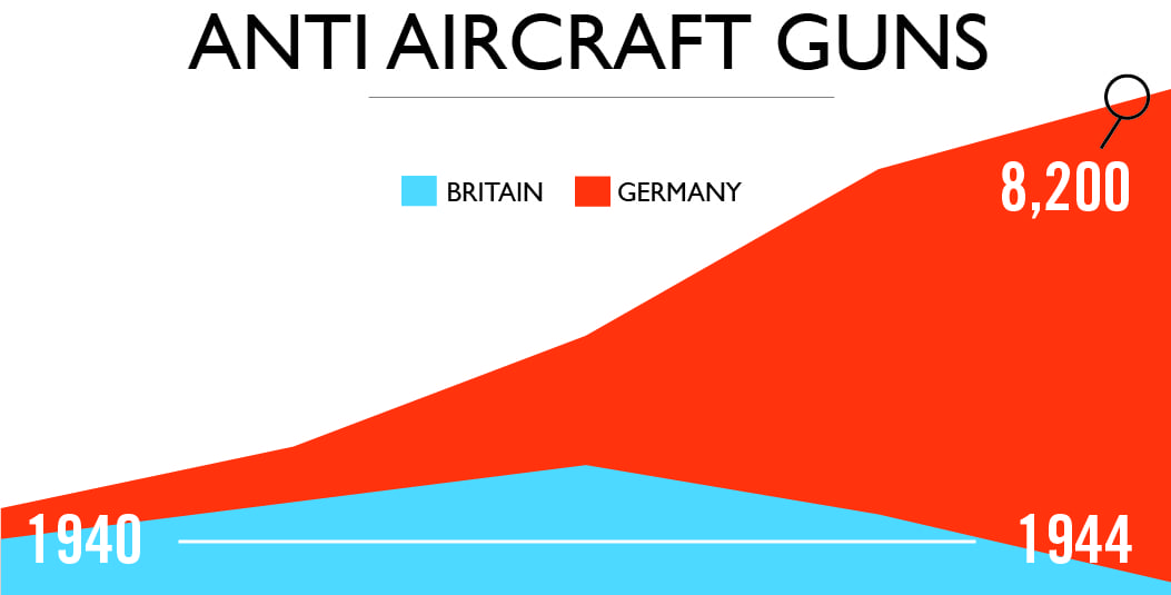
In 1940 Germany made 1400 heavy anti aircraft guns available as opposed to Britain making 900. Both sides increased production at a similar rate but around 1943 Germany’s production increased noticeably, whereas Britain’s started to decline. The threat of home invasion was over and it meant that Britain could cut production, whilst Germany diverted much of it’s manpower and resources into air defence, in the face of the increasing allied offensive. Germany produced 8,200 AA guns in 1944.
–
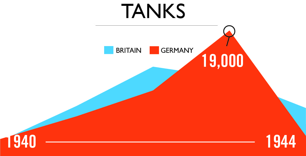
Both sides entered the war producing similar annual numbers of tanks. After 1942 Britain’s tank production, which was still higher than Germany’s, fell sharply. Soon after Germany rapidly increased her production rate peaking at 19,000 tanks for 1944.
_
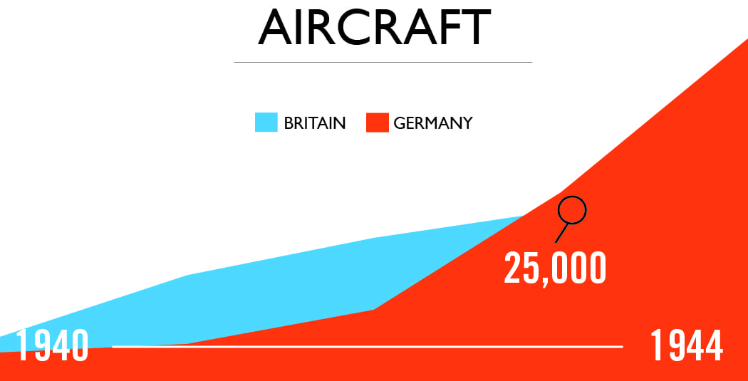
Britain made 15,000 aircraft and Germany just over 10,000 in 1940. Britain’s annual production was higher than Germany’s until around 1943 when German production increased rapidly, peaking to 39,600 aircraft made in 1944. And although Britain’s production stayed similar at 26,200 in 1944, the total weight of aircraft produced was still almost 20% higher, indicating Britain was concentrating on heavy bombers and Germany on fighter aircraft.
_
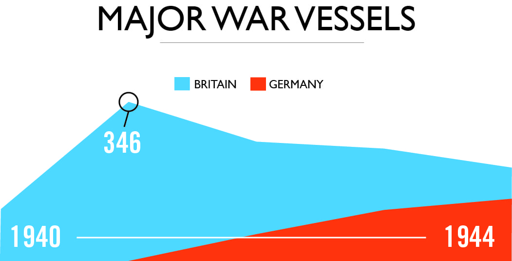
Britain had consistently produced more major war vessels than Germany over the war, peaking at 346 made in 1941. This was never matched by Germany.
Sources:
The Strategic Air War Against Germany, Report of the British Bombing Survey Unit
The Strategic Air Offensive Against Germany, Vols 1-4
—————
Thoughts:
For what will become a moving image data visualisation sequence these charts have been quite radically simplified – the intention being just to give an impression of the volume difference and the rate of change, without involving detail figures. The next test will be to animate the graphs and include narrator voice over to see how the information flows.
————–
19th October 2013