Data communicators, where is innovation happening?

Being a designer and researcher of data communication I like to keep up with developments in the field. Naturally it makes me wonder where things will go next. Where is innovation happening? (Yes, I’m asking you too!)

I have a hunch that innovation will come from anywhere that thought is extended outside of design to the experience.

A good example is ‘data manifestation’, a project by the Information Experience Design programme at the Royal College of Art. It’s about communicating data by manifestation in objects and spaces that people experience – described in ‘A manifesto for data manifestation’. It’s a vision and mission for where ‘Big Data analytics’ is going next, with an idea that physical manifestation extends communication possibilities beyond 2d visualisation.

I like the idea and think this is one to watch for where innovation will happen in data communication. But what I like even more is that designers are ‘…bringing together data science with an understanding of materials, modes of communication, sensory perception, cognitive and social processes. And especially, good design principles.’ The IED programme thinks about creating data experiences as well as creating data ‘texts’, and these people look outside of design.

Experience = innovation

I see a lot of data visualisation/infographics* and sometimes wonder how much data communicators really think about experience? I wonder about this especially when I’m the audience and it’s my own experience. So – at worst – if I look at a visualisation and I feel confused, patronised, overwhelmed, bored, confined or wondering what the point is then it scores low on my experience scale. At best, well, is it possible this visualisation could really move me…? The immersive approach in Snow Fall by the NYT, which isn’t a visualisation but has visualisation in it, comes to mind as a memorable experience.

I contemplate what success means in data visualisation as have others, because I think the topic will be a catalyst for innovation. I think success goes beyond technical considerations like efficiency, beyond website hits and going viral, beyond professional awards, and is more to do with experience.

*to expand on this distinction and the context of each see this post

Storytelling = innovation

The data manifestation project points out limitations of screen and 2D visualisation. But here there is room still for innovation. This I think is in storytelling.

My interest as a data communication designer and researcher is how story affects experience. That’s because – and it sounds obvious to say – people reason through stories. Stories move people, give them a reason to believe or not, a reason to do something or not, to take this turn or that. Who doesn’t like a story? Yet as a concept story jars with data communication because data are not stories. Data are cold hard facts. But, critically, data *have* story potential, just like any object or action inherently has a story potential. Critically it’s through narrative (by representation of facts and events) that data can *be* a story.

Narrative theory ought to challenge and inform data visualisation design more than it has done. If not the risk is stasis – in a kind of ‘visualisation means this, story means that’ scenario. The idea of storytelling with data visualisation created quite a buzz in the visualisation community last year. The conversation sadly didn’t lead to as much progress in the field as I hoped for, or hasn’t yet. For me this is because there is a skimpy conception of what narrative is or could mean in practice.

Stories can be unclear but gripping, for example. Would we design unclear visualisations if it made for a great overall experience? People don’t seem to be talking about narrative as a creative or experimental approach. Instead data visualisation focuses on quite basic narratives, which on the one hand makes sense. But creatively exploring relationships between narrative and experience is where innovation in data communication could lie. Reason and emotion make up human experience, which as Ken Burns points out in this nice short film, connects very much with stories.

_

So, data communicators, where is innovation happening?

_


_


How do we judge the resonance of data visualisations?

How do we judge the resonance of data visualisations? Your comments and suggestions are invited! 

Data visualisation and resonance may not be the most obvious bedfellows. Resonance, in a communications context, is about the extent people connect with, care about and invest in an idea. Opposed to this, data visualisation is really about data analysis – a means to an end. But the obvious move of data visualisation into popular culture, which is a result of more and more data that needs to be distilled for people to understand, suggests data visualisations need to resonate to successfully communicate to audiences who are not subject experts!

I like to think data visualisation can add value beyond being a way to deal with complex stuff. How can data visualisations really connect people with data and make it matter to them?

The appeal of subject matter provides a clue. Andy Kirk wrote about ‘Appreciating the critical role of subject matter‘ in particular how folks can sometimes be indifferent or disinterested in data visualisations. Why is this? Most likely those people didn’t connect with the content. The purpose of the visualisation was out of tune with the context and needs of the audience, so no matter how well executed it was the visualisation just wasn’t interesting to them.

Technological innovation, functionality and the craft of data visualisations alone aren’t likely to inspire resonance amongst non expert audiences, at least not in an enduring way. Yes, we can see the shapes and colours the data make – but is there something significant about that? Yes, we can compare a data set – but is there a reason to care? Questions like these are fundamentally about communication. So the purpose of a data visualisation, it’s context and the needs of the audience are foremost in the question of achieving resonance.

Let’s consider audience, context and purpose just a little more. The literature on data visualisation(1), or even just a good look at examples around the web, suggests two poles. On the one hand there are exploratory visualisations like those used for scientific analyses. They can represent the complexity of big data sets. Their purpose is to allow data exploration. Yet it’s difficult to imagine exploratory visualisations resonating very well beyond special interest or expert user groups who have prior knowledge and interest in the subject matter – and actually want or need to engage with it.

On the other hand there are the kind of explanatory visualisations for example in newspapers and magazines. Journalists/storytellers distill data first then make data visualisation part of a story so people can understand it. Visualisations like this are supposed to resonate with a non-expert audience – which is the majority of people. They need to explain and appeal unless the audience is to pass them by.

Resonance (simply, being interesting) needn’t be at odds with principles of data visualisation (like being objective and using effective ways to see and understand complex things). I think there’s room to match good data visualisation (that’s useful, accurate and well crafted) with good communication (where the visualisation needs to appeal to a non expert/mass audience).

So, right now I’m looking for particular ways of judging how data visualisations resonate with non expert audiences. Do you have ideas or suggestions, can you add or suggest otherwise to this list?

Judging how data visualisations resonate with an audience, some ideas for measures:

  • Sense of engagement, interest?

  • Motivation to work through it?

  • Recall/things remembered?

  • Empathy or care for subject(s) involved?

  • Mis/understanding of the subject?

  • Belief/trust/credibility?

  • Take away message?

  • Would recommend to others?

  • …?


—————

References

(1) See for example Illinsky and Steele’s Designing Data Visualisations (O’Reilly). They make the distinction between exploratory and explanatory visualisations, as well as touching on infographics vs data visualisation in this context.


The reader and reading data visualisation

Alberto Manguel writes about reading and readers, shares his Notes Towards a Definition of the Ideal Reader.

I recently thought about stories in data visualisation as being like vignettes, like an entry point to prompt the reader into a journey of interpretation and discovery of a bigger text. So much emphasis seems to be upon what the reader does in data visualisation – whether they are guided through a presentation of data or are free to roam through it to make up a story.

Some of Manguel’s thoughts spur ideas behind reading as an activity impacting on how individuals make meaning out of data visualisation storytelling. What does the reader expect from a text, what is their motive for reading, and how does the reader’s characteristic attitude toward reading impact on how they interpret story? Some ideas and implications:

‘The ideal reader does not reconstruct a story: he recreates it.’

Implies: you are not looking for what has already been added up and verified in a data visualisation but you want to take the source data behind it and model it again to decide if it really stacks up.

‘Robinson Crusoe is not an ideal reader. He reads the Bible to find answers. An ideal reader reads to find questions.’

Implies: you are not looking for an ‘end’ in a data visualisation story so much as a great starting point spurring further conversation and other possible stories. You are comfortable with this uncertainty.

‘The ideal reader is the translator. He is able to dissect the text, peel back the skin, slice down to the marrow, follow each artery and each vein and then set on its feet a whole new sentient being.’

Implies: you are familiar with the source data and the methods used to aggregate and visually encode them, and you have the motives and resources to respond to the visualisation in kind.

‘For the ideal reader all devices are familiar.’

Implies: you’re aware of any device that has gone towards making the data visualised in front of you – e.g. curation, aggregation, rhetoric, encoding.

‘The ideal reader subverts the text. The ideal reader does not take the writer’s word for granted.’

Implies: you are playful and you read a data visualisation from a position of scepticism.

‘Writing on the margins is a sign of the ideal reader.’

Implies: you want to and can (either physically or virtually) write notes and thoughts on a data visualisation – like as an aide memoire or when contributing to a discussion around issues that the text raises.

‘The ideal reader proselytizes.’

Implies: you feel compelled to take a data visualisation as basis for converting a person from one belief to another.

‘The ideal reader is not concerned with anachronism, documentary truth, historical accuracy, topographical exactness. The ideal reader is not an archeologist.’

Implies: you are concerned with something higher than any exactitude presented in a data visualisation – the why question is more important for you than the who what when and where.

‘The ideal reader is never impatient.’

Implies: when you read a data visualisation, if the answer (or even the question) is not obvious, you will persevere.

‘A writer is never his own ideal reader.’

Implies: you derive most pleasure and utility looking at data visualisations other people have created – not so should you want (and be able) to create your own.


These implications are not necessarily right or wrong, or indeed what Manguel implies – just a bunch of ideas that throw interesting challenges towards who we assume the reader is or what we assume their motives are when they engage with a data visualisation.

Storytelling and Data Visualisation – interview with Amanda Cox

Whilst in New York City last week I had the pleasure of meeting Amanda Cox, Graphics Editor at the New York Times, to ask her some questions around storytelling and data visualisation. This was a busy week in news terms (the Boston bombing and Texas factory explosion occurring), and owing to both our circumstances we met late in the evening in the Wall Street area. After failing to find a coffee shop or bar open in the area we settled upon the steps of Federal Hall. I thought it was a fantastic and unusual location for an interview…

 

 federal


CT) There seems to be a lot of conversation around storytelling in visualising data. One of the things with storytelling that occurs to me is that its about order and coming to a point. Whereas in data visualisation, sometimes, there’s less order and it’s more disparate or incomplete. Do you think it’s easy to reconcile storytelling with visualising data?


AC) Yeah, I think that the definition of what story telling means in data is a little sketchy.  In that I think really what people mean a lot of the time is more the idea reducing your data until the point where it means something. Shaping it I think, or moulding the data, that can either be by choosing a form that reveals something particular about the structure, as opposed to a more generic form such as a bar chart. I think the idea of what it means to tell a story with data is a little bit amorphous, like its probably true for a lot of art, like in a painting, is there a story within a painting…is there a story in Jackson Pollock pieces or in Mona Lisa.

CT) Do you think it’s possible to ‘see’ a story?

AC) Yes I do think it’s possible. I think to define precisely what that story is is a little more difficult to pin down.  Even in simple line charts, so you think of like the canonical Al Gore example, even if you did the average and think of it as one line, I think there is a clear story in that. Who the characters are in the story may be missing from the line chart, but when there is an axis of time the stories are embedded in the time axis, so it can be constant, constant, constant – then something changes, that to me is very clearly tied to the idea of a story.

CT) I read a lot about narratology and story structure. David Herman, a narrative scholar, said that there are four key things that qualify a text to be as story… 1) a story has to have events that happen in time 2) there has to be a named individual or people who have to face decisions  3) there has to be a disruption of a state of equilibrium 4) there has to be a foregrounding of human experience. Do all four need to occur in data stories?

AC) I feel that the Al Gore example of time series fits that quite well. There is a dramatic change in events, it changes because of characters. So I might not disagree with that definition.

CT) Do you ever encounter data visualisation work that is not a cohesive story that, has a lot of uncertainty or indeterminacy in it so you have to work quite hard to figure out with the story is?

AC) I think things with a lot of data – the image I have is of Aaron Koblin’s Flight Paths, which I think is great and brilliant and will hold up 20 years from now which is rare in data visualisation, but to argue that there is a story in something like that, well there is in that planes take off, but its a weak story, it’s not that compelling that plane A took off, plane B took off. But at a deeper level the pattern is compelling in itself, but it’s not really a story.

CT) I see a lot of your work has a strong sense of cause and effect.

AC) I think part of our mission or mandate, working for a newspaper, is that it’s difficult and off course to make things that just look pretty. There is a deep question of ‘why are we doing this?’ and ‘what is it?’ – so that being our mandate shapes the work and makes it more simplistic. Questions like ‘why are you showing me this?’ or ‘what do I think a reader should get out of this?’ – it’s our job as journalists to do some of that work.

CT) How much work is it reasonable to expect a reader to do to ‘get’ the visualisation – should the barriers to entry quite high and if so what does the reader get out of it?

AC) It largely depends on what the data is and how easy it connects to people’s experiences. If you’re making a local census map, where the reader is asking ‘tell me about my neighbourhood’ you can shove all of the burden onto the reader, things that people are deeply interested in we would expect people should have enough background knowledge and context to be able to figure it out. On the other side there’s business stories or things that don’t fit into people’s experience, things that people can’t be expected to interpret on their own.

CT) Do you think that storytelling is a way into adding that context of ‘why this matters’?

AC) There is a sense of handholding in data visualisation.  We ask ‘who is going to use this?’ at sketching stages. I feel like a tour guide. Instead of dropping you into an area and telling you to find a bar, I’m giving you a list of the best 5 cool places!

CT) Does data visualisation have a rhetorical angle (intentionally or not).  I’m thinking you may be able to curate or visually preference data. Is that a good or a bad thing?

AC) All visualisations, even those without a story are an interpretation of something. The choices that you make, like Koblin showing a full day of flights all at once, people will think its crazy, but if you reduced the lines then you’d get a totally difference impression. Editorial decisions, about form, how much data you’re showing definitely suggest some interpretation.

CT) Your readership presumably comes to you for an editorial perspective?

AC) I think what we value at the NY Times is the analysis and finding the right experts to tell you what things mean. Not like the front page of the Newspaper which is very edited.  It’s more hands off, they just run the baseball scores.

CT) How do you think storytelling devices from non-fiction, like for example closure, narrator voice, having suspense, or characterisation could play with data visualisation?

AC) I think the chief device seems to be surprise. It seems to be a common thread in a lot of the good visualisation that we see. The most successful visualisations have an element of surprise, something happens that you didn’t expect.

CT) That would certainly make a piece more memorable! Do you think, like people have favourite films, books etc, that its possible to have a favourite data visualisation?

AC) I think it is. That’s an interesting question. I suppose my favourite films or books made me feel something which I think is the same with data visualisation if something resonated with me in some way.

CT) Do you think that data visualisation can tell a story on its own, or is it a catalyst for something else, or does it need other text?

AC) I think it could by itself, but not maybe in its entirety. I think we are pretty good in data visualisation at handling the what, where, when questions, but we’re bad at the why questions, which are often much more interesting. I think its probably the same in something like film too – is it really possible to get in a characters head? I think I would argue that on it’s own data visualisation is always telling a story, but it might not be a sophisticated story.

CT) That makes me think of Hans Rosling’s Gapminder, where the application itself gives you the what, where and when – but when he narrated it at the Ted talks it brought so much more of the why.

AC) I think that Hans Rosling is a brilliant presenter and very enthusiastic. I think that Gapminder on its own is fine but there’s nothing special in a scatter graph.

CT) It seems having an enthusiastic narrator can makes the data more interesting and understandable! So, moving away from story and onto you! How did you get into all of this?!!

AC) A happy accident! I was in statistics grad school not having a very good time. I started applying for random things. I did a summer internship at the Times. Then an opening came up when I finished grad school.

CT) Has the field changed a lot in your time?

AC) When I look at some of the work that the guys at Fortune were doing in the 1950s, it was incredible and is better than the work we are doing today. At its core I think it’s still the same, but when I started at the Times we did nothing on the web at all.  The opportunities are so different because of the changes in technology.

 CT) Where would you like your work to go in the future.

AC) I feel like there’s a lot of room for more actionable work. The highest compliment you get is that your work is ‘interesting’, but I’d like to make more of an impact on the world. I feel that the work can go further in its relevance. I want to be able to look back on my work today in 5 years and think its terrible!

__


A big thank-you to Amanda for taking time out of her schedule to meet me, and for being a wonderful sport.

 

Visualising data: can you see stories?

Recently I’ve been thinking about how storytelling and data visualisation relate. There’s increased attention to storytelling in the data visualisation scene: Tapestry, the first conference specifically about storytelling in data visualisation, took place in February. The Guardian and New York times, among many other great quality newspapers, continue to make innovative work aimed at storytelling primarily through data visualisation; and recently noteworthy is Robert Kosara and Jock Mackinlay’s paper entitled ‘Storytelling: The Next Step for Visualisation‘.

Part of my work is digging a little further into what storytelling is or could be in this area, what people who are doing it may assume and how stories through data come across to a reader or viewer.

overview

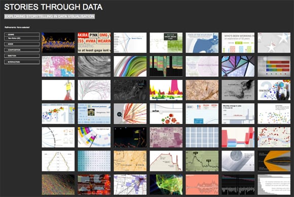
For this I’ve been developing a new corpus analysis website about storytelling in data visualization (pic above) – where I’m trying to work out some ways of measuring and judging storytelling approaches that seem to be used across a wide range of current data visualizations (more on how this is going further down).

There is a precedent for investigation into this area. Segel and Heer produced a paper some time ago, entitled ‘Narrative Visualisation: Telling Stories With Data’, that focused a lot on physical/interactive facilities of data visualisations and how they impact narrative. That paper moved to classify visualisations into ‘genres’ of designs (like ‘annotated graphs’ and ‘comic strips’) and relate those to a matrix of design ‘tactics’ (like ‘zooming’ and ‘filtering’ on data). What Segel and Heer did was to analyse case studies of data visualisations and that helped them identify some trends between said ‘genres’ and ‘tactics’. Their way of thinking seemed to open up intriguing possibilities for design and technology shaping narrative exposition in data visualisation; but I felt the approach alone could result in a technologically determined and potentially limiting way of thinking about the relationship between storytelling and data visualisation. Asking how data visualisation affects storytelling begs the reverse question too – and my approach is to ask what storytelling can bring to data visualisation; in what way can practice make most benefit of this communicative act?

I’ve taken some cues from narratology in trying to get an answer to this question. Looking further into the narratology literature, narrative can on the one hand be broken down into a set of universal laws and principles that may transcend mediums. Stories have temporality in common (they deal with time) as well as causation (they deal with cause and effect of something). On the other hand there are the more media specific narrative affordances as for example in the way that film, opera, novel and data visualisation – because of their physicality and the dimensions open to them – would be able to give a different ‘staging’ of a story.

However, if we assume that there are some fundamental properties of narrative that cross media – like structuralist theorists (e.g. Barthes, Genette) did in their move to establish some general laws and principles around narrative – then it would be interesting to see the extent data visualisations accord to such a conception. What we are talking about here are general principles in narrative such as narrative voice (who is speaking and where from?), the order of events, causation, suspense, closure and the like.

The fact that there are data visualisations that don’t really have beginnings or endings (or, more intriguingly those that make many potential beginnings and endings available) indicates that my attempt to reconcile storytelling through data visualisation with literary narrative approaches will be frustrated. But I’m not disheartened by this because if discovering that narrative data visualisations don’t relate very much to traditional modes and methods of storytelling, then this in itself is something learned!

Thinking about the second conception mentioned above – the storytelling affordances that data visualisation brings as a medium – a pursuit of this could be to find out what, if anything, data visualisation brings anew to storytelling that can’t easily (or at all) be achieved in the same way elsewhere. Kosara and Mckinlay touch on affordances in the earlier mentioned paper, relating to medium specific features that can provide narrative structure. In visualisation the most obvious affordance would seem to me to be around tapping into innate human abilities for visual perception, to make sense of complexity with relatively little cognitive load. Although this invites the question of authorship and intention when we imagine the wielding about of huge datasets to which plausibly can invite impressionistic and shallow readings (or, more positively, serve to give an interesting and compelling starting point). As well as this we could add user interaction and collaborative visualisation as distinct data visualisation affordances that come to bear upon storytelling. But such novelties can also be imagined to complicate the telling of a story – as for example if you interact with a storyline by selecting and manipulating the constituent data, to what extent does your agency change the narrative and work against the possibility of telling a cohesive story.

So it seems this is a multi-faceted problem. I wanted to get some ground rules for storytelling (whilst keeping in mind the perils of being reductive and simplistic) – so setting off by reviewing the most prominent literature on narratology helped – but it must be acknowledged most of narratology seems to prefer literary forms of narrative as its subject. Whether or not modes of storytelling employed in literary fiction have much bearing for data visualisation is something to reconcile in itself.

Nevertheless the business of narratology is in defining the very nature of ‘narrativity’ – or, what is it in a text that ‘tells the story?’ This is a complex and problematic topic where it can be seen, rightly, that there are very different conceptions about what constitutes narrative. There are those that advocate general narrative laws and principles as being transferable between mediums and contexts, there are those that reject tendencies to generalise about narrative structure, who see narrative instead as much more of a contingent and indeterminate thing.

Starting with traditional narrative conceptions, I set about defining some parameters with which to build a narrative analysis framework. In my reading for this I found recurring aspects of narrative called into reference, such as Genre definitions; whether or not there is a narrator and from what perspective the narratorial voice comes from; the extent that story time compares to telling time; the extent that human sensation or feeling is expressed; or the way that events are ordered in time, and so on. All of these things can be called into question when thinking about how a particular story is being told. I found the narrative parameters I collected were many and varied, so straight away devised five high level categories with which to begin:

  1. Genre –  Describes the ‘canon’ of story that the sample may belong to.
  2. Mode –  Describes ways in which voice may be used for story exposition.
  3. Composition –  Describes ways in which events may have been ordered.
  4. Emotion –  Describes ways in which the narrative may describe or evoke human emotion.
  5. Interaction – Describes possibilities for non linear and interactive ways of experiencing stories

The above higher level categories led me to forming this initial framework for analysing storytelling in visualisation – where you can see a number of low level factors I am taking into account. Yet because I wasn’t at all expecting narrative in data visualisation to always parallel closely with traditional narrative structuring, I thought it prudent as well to consider a wider conception of narrative – i.e. going beyond established literary/text based narrative approaches. I intended to look beyond the neat notion of story as a convenient way to package and comprehend, simply put: where things are not so black and white! This led me to considering indeterminate and emergent forms of narrative, where the story depends to some extent on what the ‘reader’ does, or how patient they are when story is elusive.

All of these storytelling modes and methods I took into account when gathering together and analysing a corpus of data visualisations. You can see how this is developing on that site especially created for this task, put together with great thanks to Carl Tawn for his help on this, a gifted developer and without his skills it would never have got past the technical boundaries to get operational.

detail

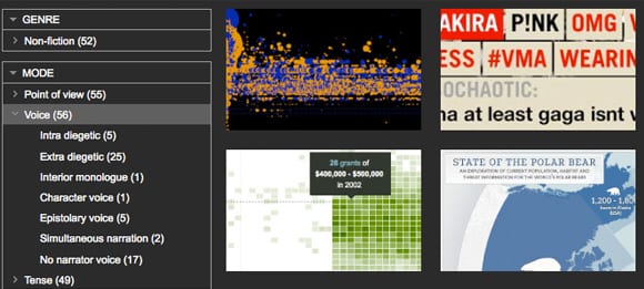
Up until now 50 data visualisations of diverse origins and approaches have been put into that corpus and analysed according to my initial framework. Playing around on the corpus site allows you to filter and group the storytelling aspects (example image above) and see what approaches are more or less common. This is not (yet) a very scientific approach but with all the broad problems and conceptions of storytelling and data visualisation as I see them, then necessarily my starting point for gathering and analysing the work is broad too. In the spirit of visualising data I then created some visualisation from my research data that comes out of the corpus analysis as it presently stands. See below…

Graph 1: Primary Analysis Purpose, Utility, Display Context and Media Type. Interesting that from the samples analysed to date this indicates a fair split between the exploratory and explanatory kind of visualisations, as well as a number that are somewhere in-between both poles.

Notes:

1. Primary analysis purpose (i.e. what the visualisation is primarily trying to represent);
2. Utility (i.e. whether the vis attempts to explain the phenomena or allow you to explore it, somewhere in-between or neither);
3. Media type (i.e. in what physical format does the vis appear)
4. Display Context (i.e. what ‘area’ does the vis appear in)


Graph 2 (below): This graph details the narrator point of view (i.e. the person perspective) that I found each visualisation took (including those that seemed to have no narrator point of view too). Interesting to note that from the samples so far analysed, Most fall into the third person perspective narrator, or no narrator voice.


Graph 3 (below): This graph details the kind of voice employed in the telling of each story (i.e. whether inside or outside the text, or reported speech). Also detailed are cases having no apparent narrator voice. Interesting to note that from the samples analysed to date most have either an ‘extra diegetic’ narrator voice (the voice is coming from outside the story) – or no narrator voice.


This is exactly where my investigation into storytelling through data visualisation is at now. Next on my list is to further analyse my research data to detect where any gaps, patterns (and of course errors!) exist and can move knowledge onwards (another post).

In ‘Storytelling: The Next Step for Visualisation‘ Kosara and McKinlay neatly ‘…define a story as an ordered sequence of steps, with a clearly defined path through it’ and base their ‘working model for how stories are constructed […] on the way journalists work.’ – which makes sense in light that most data led visual storytelling appears to come from journalism, where we may assume for the most part that journalists are seeking to present facts in a balanced and logical way to come to a point. In that way the journalist as story creator acts as interface between reader and source data – curating and crafting its presentation so ‘Most of the source material only serves as the raw material for the written piece’ – in order that the reader experiences an uncluttered and coherent story in a timely (and presumably enjoyable) way.

But their working model is only one approach to storytelling through data visualisation, predicated as it seems to be that things ought to have structure and make sense. To me stories don’t always seem that neat. Another approach could acknowledge possible creative affordances of storytelling (that could also be problematic, in terms of communication) – but nonetheless engaging. Story can be a very emotive and immersive way of recounting events but one that doesn’t always necessarily have to make sense. What if, for example, we conceived of story as contingent upon the participation of the reader, or as representation of events not necessarily always having causation or closure?

There are other – at least as engaging – possibilities to visualise data that veer away from purposes of efficiently making sense of and coming to terms with complexity. And if we consider that storytelling is a ‘messy’ concept and factor in that storytelling raises questions around authorship and agency, it then seems more problematic (but nonetheless intriguing) to reconcile storytelling with visualising data.

So, can you see a story? Plausibly yes, but for data visualisation it seems this depends whether you want or expect to be given a beginning and ending, and how much effort you’re prepared to put into reading (or even, making) the story. To conclude this post I want to bring in a couple of brief thoughts:


‘Tools have no stories to them. Tools can reveal stories, help us tell stories, but they are neither the story itself nor the storyteller.’

Moritz Stefaner


‘Does the world really present itself to perception in the form of well-made stories, with central subjects, proper beginnings, middles and ends, and a coherence that permits us to see “the end” in every beginning?

White, H (1987) ‘The value of narrativity in the representation of reality’ in The Content of the Form: Narrative Discourse and Historical Representation, Baltimore: John Hopkins University Press


‘Sometimes I don’t want to have to do the work. Sometimes I want someone to read to me while I relax.’

Samyn, M (2008) The Challenge of Non Linearity, (quote from commentariat)


‘Once upon a time there was ___. Every day, ___. One day ___. Because of that, ___. Because of that, ___. Until finally ___.’

Cyriaque Lamar, The 22 rules of storytelling, according to Pixar

‘[Narrative is] a basic human strategy for coming to terms with time, process, and change’

Herman et al, 2005:ix, The Routledge Encyclopedia of Narrative, Routledge, 2007


—–

Comments welcomed. Until next time, thanks for reading.


Chris.