‘Premise: The Two Types of Data Visualisation, and Why it Matters to Understand the Difference.‘ — Tom Steinberg
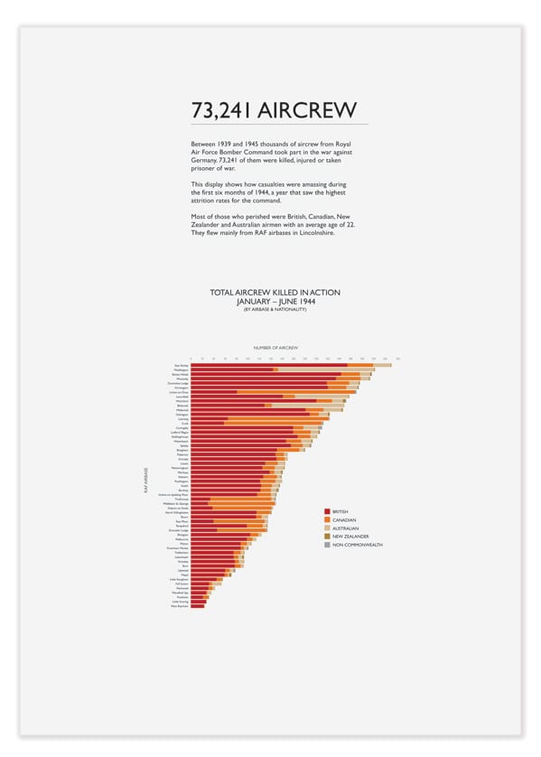
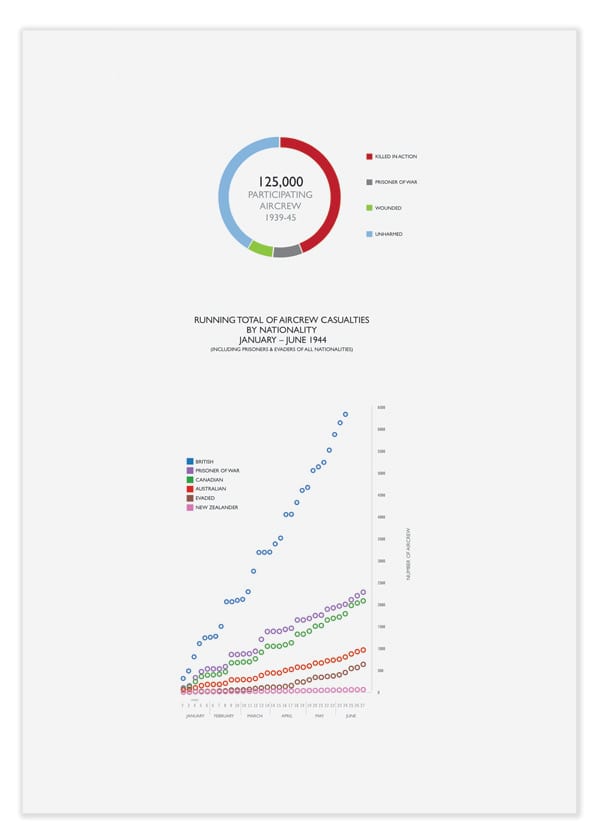
It’s a bold claim on Tom Steinberg’s blog, but nonetheless thought provoking – that there are only two types of data visualisation: ‘Story Visualisations’ and ‘Answer Visualisations’. In Tom’s words ‘Story Visualizations are those produced by one set of people with the goal of telling a story to an audience,’ whereas ‘Answer Visualizations are produced to supply an answer to a single question posed by a particular person.’ A pretty neat and handy framework for talking and thinking about visualisations. But one that’s also problematic.
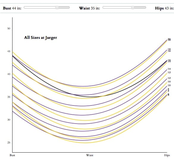
There’s no doubt that the kind of ‘Answer’ visualisations Tom refers to (for example the ‘What Size Am I?‘ visualisation) have a purpose and scope quite distinct from, lets say, more complex and onerous forms of data visualisation. But at the same time the divide he sets up doesn’t account for the kind of visualisation where ‘answers’ (or maybe at least signposts to them) appear out of a story told through data. What I think Tom is referring to is more of a distinction of functionality that the ‘Answer’ class of visualisations have which is akin to ‘apps’ – in as much as they are visualisations more clearly targeted toward a specific user need, well defined in purpose and being most efficient for carrying out a limited range of tasks. Being Tom’s case in point, the ‘What Size Am I?‘ ‘app’ is a great example of this:

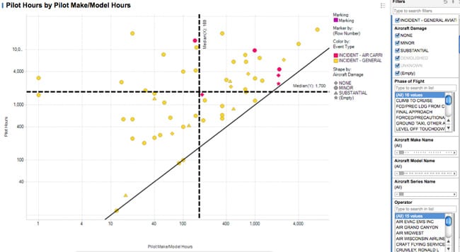
But offloading the then non ‘Answer’ types of visualisation into the ‘Story’ camp sets up a binary of ‘Story’ and ‘Answer’ which is less convincing and perhaps needs to be nuanced, or better explained. We might turn to data visualisation for Business Intelligence as an example of combined ‘Story’ and ‘Answer’ visualisation, where data is visualised and can be explored, say to diagnose a business problem or to help spot a business opportunity. This example from Spotfire shows a data visualisation that allows for selecting data sets and manipulating data views so that the data ‘story’ and ‘answers’ might be found:

Examples such as this might not have clearly defined questions or even stories, at least not before the user works with the visualisation to define what they might be. We might also turn to data-led journalism – where an insight gained through visualising the data can form a story, a question and/or an answer. We need to accept that examples such as this involve data having been curated in some kind of way, so of course the extent of possible ‘Stories’ and ‘Answers’ ensuing from the data will by default have been governed. Their functionality and purpose may be less clearly defined for their ‘users’ too. But is does hold that visualising data to tell ‘Stories’ can lead to ‘Answers’ too. This comes across as a barred combination in Tom’s present framework.
In my own humble work I’ve found that both approaching data visualisation with and without a question in mind yields answers (and often even more questions), both for me and the people having seen or ‘used’ my work. However I’m a practitioner (albeit of modest skills and means) and Tom is talking about data visualisation from a user-cum-creator point of view. Tom is concerned that ‘lowering the barriers to Answer Visualisations seems almost unimaginably hard and distant’ – concluding with an air of inevitability that it won’t be until the right software or system becomes available that ‘everyday people’ will be able to do their own bespoke forms of data visualisation. This may hold true – although freely available programmes such as Tableau Public offer powerful exploratory visualisation now (and are realistically within the grasp of most computer savvy people). At the same time open source languages for coding of data visualisations are reaching maturity (and, aren’t kids being taught to code at school, anyway?!). But perhaps this is all too technologically deterministic – surely it’s just as important that the ‘everyday user’ develops the right capability to be able to deploy and perceive data so that they can recognise the answers (and questions?) that the data is telling too?
I thank Tom for his excellent blog post and insight because it really got me thinking. As always, comments are welcome.
Chris.
