Novel (adj): New or unusual in an interesting way.
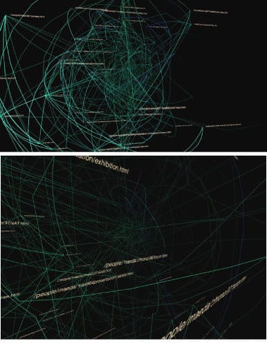
Finding novel ways to visualise relationships and networks seems to have been a preoccupation in the data visualisation field. But what is it to be ‘novel’ in the context of data visualisation? Can it be measured by insight that the visualisation gives? Or maybe how much aesthetic impact is achieved? Perhaps both. In the academic and professional press ‘novel’ is sometimes attributed to visualisations that function to help users distil and make sense of complex information through visual means of order, clarity and powerful technological facilitation. At other times it may be attributed to visualisation work that – whilst relating to information as its starting point, is less concerned with clarity and order moreso than aesthetic and subjective experience. Such types of work might be regarded simply as powerful because they are aesthetically rich, maybe even beautiful. Practice relating to the visualisation of networks and relationships can be seen to range across these extremes. This review will discuss contemporary practice where recent work that could be regarded as novel will also be set against what we might consider to be norms in the specific context of network and relational visualisation.
1. GitHub –
http://lumberjaph.net/graph/2010/03/25/github-explorer.html
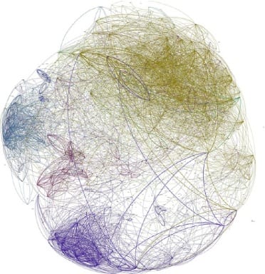
Fig. 1 World community on GitHub – properties of the graph: 16443 nodes / 130650 edges
‘GitHub is a large community where coders can collaborate on software development projects. People check code in and out, make edits, etc. Franck Cuny maps this community (with Gephi), based on information in thousands of user profiles… Cuny then looks at the structure within the coding networks, which is the most interesting part of the project.
Source: http://flowingdata.com/2010/03/31/mapping-the-github-community/
GitHub (figs. 1, 2, 3) – http://lumberjaph.net/graph/2010/03/25/github-explorer.html
Frank Cuny devised this node based diagram using the technique of zooming through levels of information that are each categorized into sets denoted by colour. Derived from a computer programmed visualisation, this is a series of prints to visualise locations of and relationships within communities. More than 17,000 GitHub users are ‘mapped’ in this way. Complexity is perhaps the overwhelming initial impression. What does the viewer do? In terms of the ‘tasks’ that we might expect users to perform when using this visualisation, Shneidermann’s “Overview first, zoom and filter, then details-on demand” model of typical tasks comes to mind that (according to his ‘Mantra’ [1]) a visualisation should be expected to support.
At the most expanded view (fig. 1) the density of information and complexity of its structure are most striking. At this level the work could be considered in Iliinsky and Steele’s terms as an ‘infographic’ [2] – where the design is aesthetically rich but relatively data poor. What we can see is a general impression of clusters of information that are roughly arranged in ‘clumps’ according to geographic location. A general sense of linkage is given although at this level it is not possible to derive meaningful information. One can get the impression that there are definite centres to the data through visual density of lines that denote connections in the network which have been caused to overlap and so build up a stronger sense of shade than that occurring at the edge of the clump.
Boundaries between clusters are loosely definable but do seem porous in this view. Given the scope of this view it is not possible to see further details about nodes at a high enough resolution for them to make much sense and so little insight is possible, moreso the view serves to convey that there is a large amount of data that in a complex way is structured within to make a body of information. Being aesthetically rich this view is likely to be limited in purpose, in this case to an overview. It is interesting to consider the diagram in Tufte’s ‘data to ink ratio’ terms [3], where (a) there is a large amount of data that (whilst arguably efficiently drawn) causes a lot of ink, and (b) the resultant ‘ink’ can only give a limited and general sense of the information on display. This view is aesthetically ‘interesting’ however and the importance of this should certainly not be underestimated as it is more likely to appeal to the senses and so perhaps invite further interaction. In fact there is much to say in the academic literature around information visualisation that responds to developments in this field having mainly been led by computer sciences and engineering, ‘there has been limited exchange between infovis researchers and artists’ according to Judelman [4]. Some ground is being made to reconcile what we might consider as two polar opposites, which as he terms in his paper ‘can provide aesthetic and conceptual inspiration for visualisation design in order to bridge the gap between science, art, technology and design.’ More about this to follow in a later literature review, which is beyond the scope of this practice review.
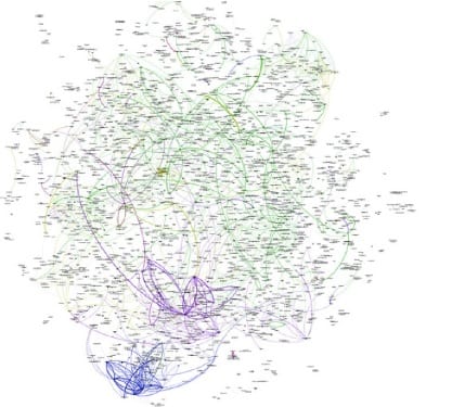
Fig. 2 European community on GitHub – properties of the graph: 2711 nodes / 11259 edges
In the detail view (fig. 2 ) we have ‘zoomed’ in to isolate a particular area and in this we can see nodes at a greater resolution. A relatively high degree of clarity results when compared to the previous global overview, where more legible naming labels are also afforded in this view and a better impression of the subtle differences in line weight/colours can be seen. Cuny states his visualisation methodology:
Each profile is represented by a node. For each node, the following attributes are set:
* name of the profile
* main language used by this profile, determined by github
* name of the country
* follower count
* following count
* repository count
An edge is a link between two profiles. Each time someone follows another profile, a link is created. By default, the weight of this link is 1. For each project this person forked from the target profile, the weight is incremented.
At this level a different and more precise view of information is seen. According to the author ‘This one shows interesting features. Some countries are really isolated. If we look at Spain, we can see a community of Ruby programmers, with an important connectivity between them, but no really strong connection with any foreign developers. We can clearly see the Perl community exists as only one community, and is not split by country. The same is true for Python.’[5]
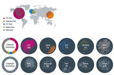
Clarity of information however is still perhaps one difficulty of this visualisation. It has been ambitious to include so many data dimensions in the view. Now we have ‘zoomed’ it is difficult to imagine how this view is orientated within the rest of the ‘world’. The geographical relationship intended to be figurative of participant locations within the world is perhaps less meaningful and indeed within some of the views that are printed as ‘posters’ the following world keys are sometimes included and help to make sense of the colour systems in place.
In (fig. 2) above however we are better able to make sense of connection between nodes and the relationships/boundaries in place there. The choice of tonal variations for the most part only gives a general impression of ‘hubs’ in each of the separate sets of nodes that represent a language.
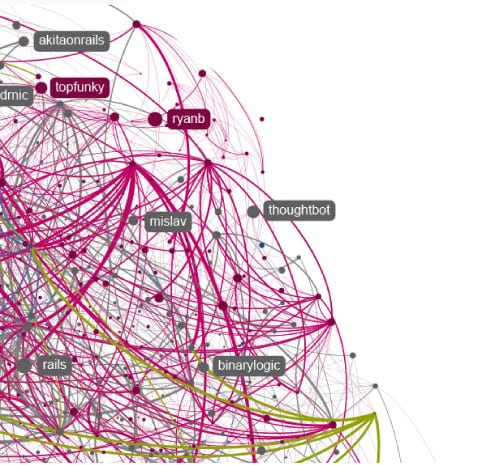
Fig. 3 GitHub at a greater degree of magnification
At a very high degree of ‘zooming’ (fig. 3) we are then best placed to see finer details, where differences in colour and line weight are more pronounced and labelling is better legible. Although what we don’t ever seem to have achieved is the ‘filtering’ part of Shneidermann’s aforementioned tasks. From the still remaining overcomplexity it is difficult to work out why it was ever meaningful to combine all of the separate ‘languages’ as clusters of nodes in this way. At the full extent of the zoom little ever becomes very clear and one gets the impression that infinite levels of zoom would only result in further complexity – whilst at the same time rendering the spatial positioning of the data exponentially more remote. If this were to be made an interactive visualisation then the technique of ‘filtering’ the data at the discretion of the user would be useful. This need not result in diminishing the aesthetic quality of the design moreso than allowing the removal of complexity in cases where it does not serve to make the data any clearer. Stephen Few explains the purpose of filtering ‘…to get any information we don’t need at the moment out of the way because it is distracting us from the task at hand.’ [6]
2. Context preserving visual links –
http://alexlexvisual.blogspot.com/2011/10/context-preserving-visual-links.html
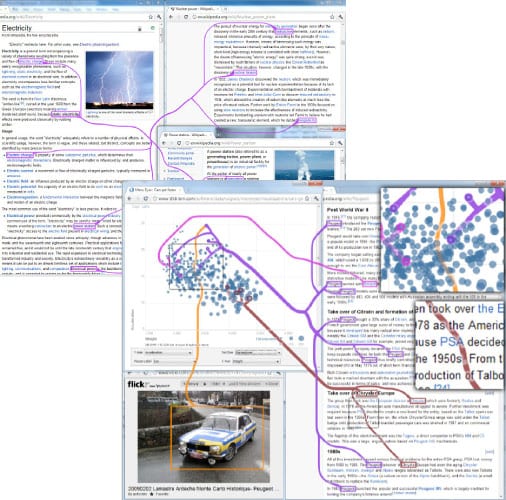
‘Context-preserving visual links are lines that connect items in a visualisation or set of related visualisations to highlight those items and thus make them easier to find, and do so in a way that minimally occludes other information’
Source: http://www.perceptualedge.com/blog/?p=1090
This application won the InfoVis Best Paper of 2011. It supports strong visual linking of datasets to indicate relationships and appears to be able to do this within a wide variety of contexts. The visualisation method used is apparently quite straightforward in terms of its visual form, although we can imagine the programming involved in creating the links that must work dynamically with heterogenous data to be complicated.
Fig. 4 Context preserving visual links, examples in use with various data
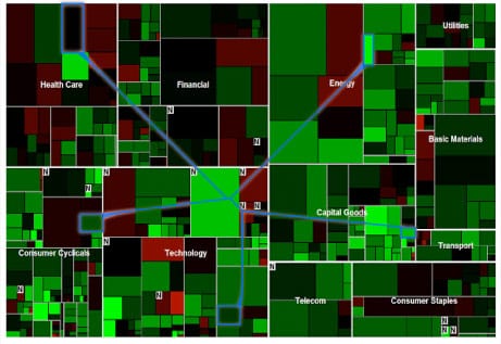
This approach to relational viualisation has a very strong and one might say overly heavy aesthetic. The ‘lines’ that form links are very assertive within the context in which they are placed, and need to to achieve salience. This is perhaps naturally necessary because the aesthetic elements that are being linked dynamically can not be anticipated and will not be a constant. As an extreme example the application can even be seen to be working within other information diagrams, Such as in Fig. 5 where further relationships between sets of visuals has been supported.
Fig. 5 Context preserving visual links, example in use within a treemap visual.
Naturally, criticism toward this visualisation method has been forthcoming. In a reaction against this work Stephen Few argued that the application can be no substitute for what he considers poorly designed information visualisations and that in fact this method would very likely lead to making connections between data that shouldn’t or couldn’t really exist. ‘The lines are the most salient objects in the display, yet they mean nothing. Drawing someone’s attention to visual content that is meaningless undermines the effectiveness of a visualisation’ [7]. Few seems to want the data to speak without being guided and deems that an effective visualisation should be able to achieve this without the heavy lines, ‘The best methods apply visual attributes to those items that we perceive preattentively, causing them to pop out in the display. This approach highlights items without adding meaningless visual content to the display.’ [ibid]
In support of the application its authors state ‘The results of a user study support our hypothesis that context preservation does not have a negative impact on either the subjective or quantitatively measured task performance in a simple visual search task involving complex visualisations. In contrast, subjective feedback suggests that users perceive context-preserving visual links as more attractive than straight links or simple highlights. Irrespective of their form factor, our experiment also showed a clear benefit of visual links compared to simple highlighting without any line connections for visual search tasks.’ [8]
3. Circos –
‘Circos is a software package for visualising data and information. It visualises data in a circular layout — this makes Circos ideal for exploring relationships between objects or positions. There are other reasons why a circular layout is advantageous, not the least being the fact that it is attractive.
Circos is ideal for creating publication-quality infographics and illustrations with a high data-to-ink ratio, richly layered data and pleasant symmetries. You have fine control each element in the figure to tailor its focus points and detail to your audience.
Circos is flexible. Although originally designed for visualising genomic data, it can create figures from data in any field. If you have data that describes relationships or multi-layered annotations of one or more scales, Circos is for you.‘
Source: http://mkweb.bcgsc.ca/dev/circos/
A very distinctive format that plots complex relationships in a circular framework. Originally intended for use with Genome data the format has over time been systematized and offered for use commercially, applied within a wide variety of contexts with any kind of information where relationships need to be visualised.
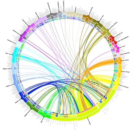
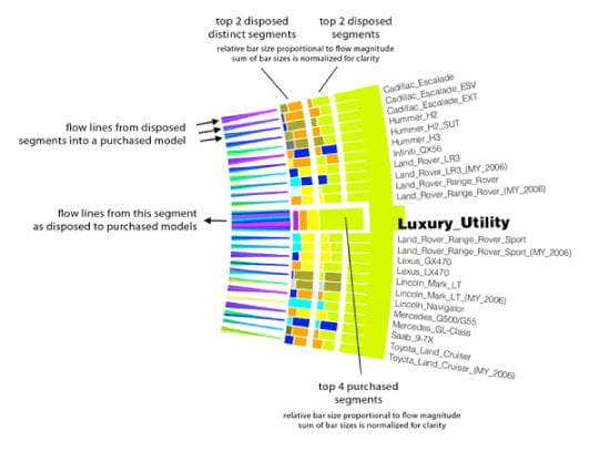
Fig. 6 overview of relationship set (this application represents customer ‘flows’ as they trade one variety of car for another)
Fig. 7 detail of previous view showing data and key
A limited amount of interactivity is possible with the circos device (that is when the visualisation is not presented in printed form). The system is automated to populate the structure with a data set and the parameters for encoding data points need to be established. The system allows for filtering so that the user can isolate for example one category of the data and view just the links originating or terminating at a certain point.
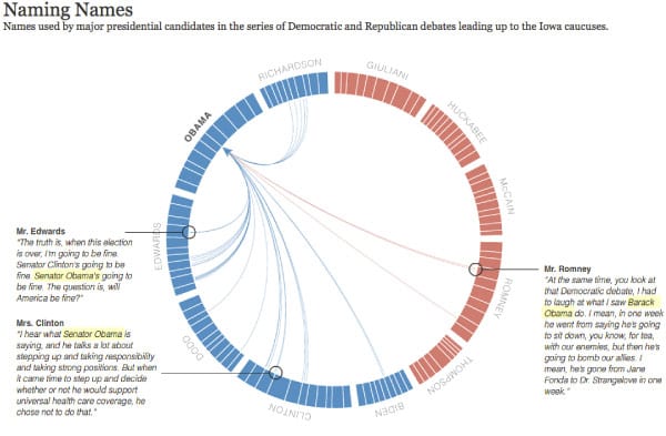
Circos can be seen to accomodate very complex data yet at the same time seems to be most powerful when the data is simple. Fig. 8 shows the application in use to represent names referred to within speeches and interviews in a campaign. This visualisation was run to support an article in the New York Times. The visualisation was partly interactive and included contextual information on rollover.
Fig. 8 Circos used for ‘Naming Names’ in the New York Times. Source: http://www.nytimes.com/interactive/2007/12/15/us/politics/DEBATE.html?ex=1213592400&en=dce493d096bcffe8&ei=5087&excamp=NYT-E-I-NYT-E-AT-1219-L6&WT.mc_ev=click&WT.mc_id=%20NYT-E-I-NYT-E-AT-1219-L6
Circos is perhaps a good example of balance between functionality and aesthetic appearance. Use of space is efficient and the resulting visualisation tends to be quite aesthetically pleasing. Because it offers filtering it contains a number of usable views that might better reveal relationships and offer insight, where otherwise the ‘top level’ graphic can generally be too over-loaded to be of use and it just becomes a pretty ‘info-graphic’. Circos has arguably made the ‘data in circles look’ ubiquitous!
4. ‘Connections’ for Facebook –
http://www.obscuradigital.com/work/detail/f8/
‘Obscura Digital created a physical, social, augmented reality experience dubbed “Connections” at F8, Facebook’s developer’s conference. Attendees swipe in to the experience using their RFID enabled event badge. Multiple overhead projectors map visuals to the floor and an array of 3D cameras are used to reliably track any number of people within the space.
Once “logged in” to Connections, a radial visualisation, constructed from the user’s social graph data, surrounds them creating a unique “fingerprint”. Colored lines extend from the circles connecting people who share one or more of the observed metrics (mutual friends, interests, workplaces, schools, locations, birth sign, or non-English languages). When two or more people, who have mutual connections, stand within close proximity, a slideshow of mutual friends and interests appear between them.
Positioned behind the Connections space, a large screen shares aggregate data about the collective group- surfacing common interests and profiling the most connected of the group.’
Source: http://www.obscuradigital.com/work/detail/f8/
Fig.9 Connections
Engaging users in a spatial context is perhaps the most striking aspect of ‘connections’. The design breaks free of the computer screen environment to involve the body in what appears to be a visceral and intuitive way of interacting with information. Of course this visualisation method is context specific (targeted at specific data within Facebook) and involves highly specialist technological resources. At the same time we could imagine perhaps any kind of information visualisation taking place within physical space. This is an exciting idea and one that Vande Moere furthers, ‘With computing technology and the access of information influencing every aspect of our everyday lives, one can question the current habit of information displays to ‘simulate’ real world metaphors, and whether information could instead be conveyed by approximating the analogue and tangible characteristics of our daily experiences.’ [9]
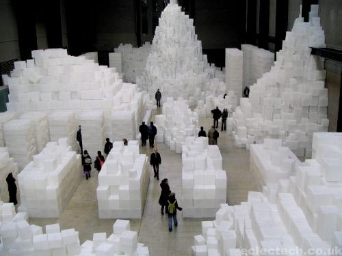
5. Embankment (Rachel Whiteread) –
‘…made from 14,000 casts of the inside of different boxes, stacked to occupy this monumental space. The form of a cardboard box has been chosen because of its associations with the storage of intimate personal items and to invoke the sense of mystery surrounding ideas of what a sealed box might contain.’
Source: http://www.tate.org.uk/modern/exhibitions/whiteread/
Far from being information visualisation proper, Whiteread’s piece appears to be so much about information. Information that you have to walk around and negotiate in physical space. This has to be a tactile and visceral experience.
The technique is simple; presence, absence – what might information visualisation learn from art practice?
6. Google ripples –
https://plus.google.com/ripples
‘The ripple diagram shows this post spreading as users share it on google+. Arrows indicate the direction of resharing. (Only recent public posts show up) Circles within circles represent a resharing sequence, so large circles indicate heavy resharing.’
Source: https://plus.google.com/ripples/details?activityid=JavTTDqMMUh
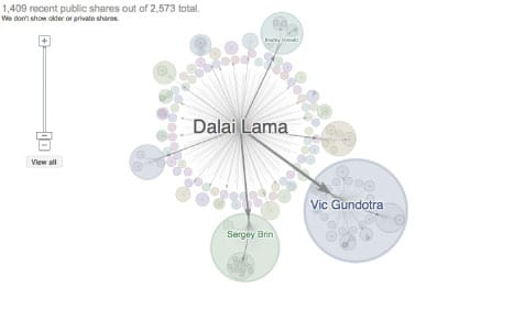
Figs.10a & 10b Google ripples view (expanded and zoomed in)
Using time as a display dimension Google Ripples (figs. 10a, 10b) shows how one piece of information (in this case a message from the Dalai Lama) has been shared across a network. The diagram displays flows of information through a network. The user can interact with all the data nodes and pan/zoom around in order to select the node and find out further contextual information. Larger circles seem to represent bigger or more influential ‘sharers’ who within their network have initiated more further sharing.
7. Bibliospot –
http://www.iamalexandra.com/biblioweb.html
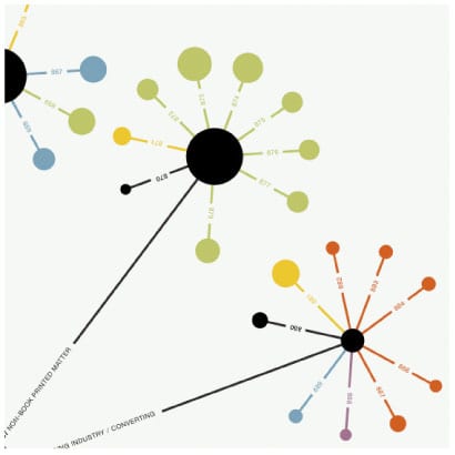
‘Visualisation of the St Bride Library collection showing the library’s classification hierarchy and volume of information per subject. Each spot represents a class, the size of the spot represents the volume of information within the class, the position of the spot shows it’s place within the classification hierarchy and the colours show the type of information (historical, artistic etc).
The print is an example of a visualisation method that could be applied to any library with a similar system – which would enable comparison between libraries and reveal those with more/less information on particular subjects.‘
Source: http://www.iamalexandra.com/biblioweb.html
Fig.11 Bibliospot
Fig.12 Bibliospot
Alexandra Sheppard devised this simple graphical form to be scalable and adaptable as a visual tool for mapping references. One could imagine the scalability of this device within an interactive visualisation which could also be further extended by techniques such as filtering, zooming and panning that interactive visualisation affords. Although the information that this device contains is likely to be complex, Sheppard has not taken the approach of aesthetic overload and has instead introduced a simple system of displaying visual hierarchy that creates easily distinguishable ‘clusters’ that then ‘fan out’ into subsets at a lower level of hierarchy.
8. Sense of Patterns –
http://casualdata.com/senseofpatterns/
‘Sense of Patterns is an on-going project, a series of printed data visualisations aiming to depict the behaviors of masses in different public spaces. The visualisations have a focus on the patterns of moving entities in public like commuters, cars and public transportation vehicles as well as the interaction between these entities and physical structures like roads, sidewalks, buildings and parks. The project intends to provide strong visuals on what we all experience in our daily lives in different cities.’
Source: http://casualdata.com/senseofpatterns/
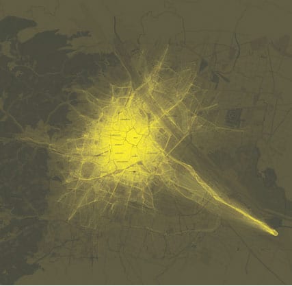
Fig.13 Sense of patterns: one day of Taxis in Vienna
This is an example of a printed information display that is based on geo-tagged information. This format seems best suited to basic data such as hot spots; visualisations in this form are typically aesthetically rich and information light. They allow a general impression and are aesthetically very interesting, but are perhaps not best suited to meaningful analysis of networks and relationships beyond a general impressionistic level. The animation of taxi-ride data, available at the same site, adds a time dimension to the visualisation but it is difficult still to derive anything meaningful from the visualisation other than some areas can be expected to be frequently busy in the location. This is probably a case of form over content, the picture is seductive and pleasing but offers little in the way of insight.
9. Jigsaw –
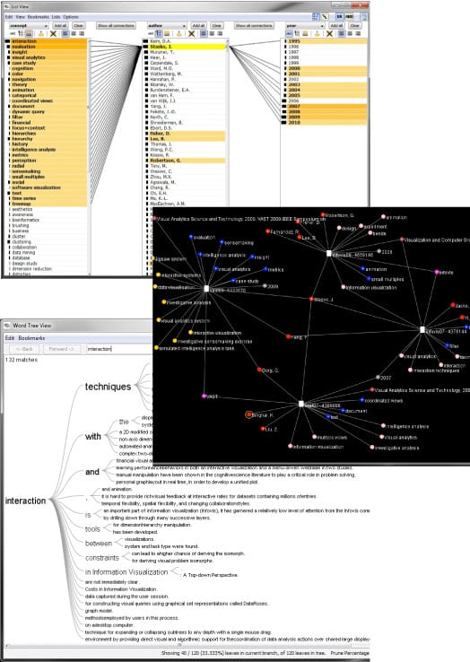
http://www.cc.gatech.edu/gvu/ii/jigsaw
‘Investigative analysts and researchers acquire clues and connect small bits of evidence to uncover larger plans, stories, or narratives, and to simply gain a better understanding of the information. Often, the individual bits of evidence are short text documents or spreadsheets, and analysts must examine large collections of such documents in order to “put the pieces together” and formulate a well-supported hypothesis about actions that may occur in the future. As the number of documents to examine rises, it becomes more and more challenging for analysts to understand the data and make judgments about it.
We are creating Jigsaw, a visual analytics system to help analysts and researchers better explore, analyze, and make sense of such document collections. Our specific objective is to help analysts reach more timely and accurate understandings of the larger stories and important concepts embedded throughout textual reports.’
Source: http://www.cc.gatech.edu/gvu/ii/jigsaw/views.html
Fig. 14 Jigsaw interface views
John Stasko leads a team of developers and researchers at Georgia Tech. This application supports visual network analysis to aid insight into complex and disparate information. Jigsaw has several view modes that can show relationships in different graphical ways. Fig. 14 shows some of the interface views (list view, graph (node) view, word tree view) within the system, which in an optimal condition are able to run simultaneously across several computer screens. Each of the views are able to respond to user input in order to dynamically display relationships between the data, also each of the views are able to be linked to and so can update other views.
10. Frame Net –
https://framenet.icsi.berkeley.edu
‘The FrameNet project is building a lexical database of English that is both human- and machine-readable, based on annotating examples of how words are used in actual texts.
FrameNet is based on a theory of meaning called Frame Semantics, deriving from the work of Charles J. Fillmore and colleagues (Fillmore 1976, 1977, 1982, 1985, Fillmore and Baker 2001, 2010). The basic idea is straightforward: that the meanings of most words can best be understood on the basis of a semantic frame: a description of a type of event, relation, or entity and the participants in it.’
Source: https://framenet.icsi.berkeley.edu/fndrupal/about
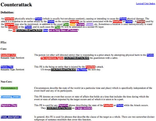
Although graphically perhaps the most crude of examples in this review set, the concept of Frame Net is powerful because it uses simple visual means to show extended semantic relationships between words in a text. Very subjectively I have to say, it is attractive despite its crudeness. Perhaps the most allied to the subject of my own research and practice, this is chiefly a system that aids analysis and understanding of texts through simple visual means.
Fig. 15 Example of Frame Net during search for the word Counterattack
11. Visual Thesaurus –
http://www.visualthesaurus.com
‘The Visual Thesaurus is an interactive dictionary and thesaurus which creates word maps that blossom with meanings and branch to related words. Its innovative display encourages exploration and learning. You’ll understand language in a powerful new way.
Say you have a meaning in mind, like “happy.” The VT helps you find related words, from “cheerful” to “euphoric.” The best part is the VT works like your brain, not a paper-bound book. You’ll want to explore just to see what might happen. You’ll discover — and learn — naturally and intuitively. You’ll find the right word, write more descriptively, free associate — and gain a more precise understanding of the English language.’
Source: http://www.visualthesaurus.com/howitworks/
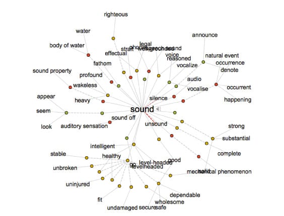
Fig. 16 Visual Thesaurus
A simple interactive node diagram that allows users to navigate language based on pre-determined relational sets usually found in a printed thesaurus. Related nouns, verbs, adverbs and adjectives and their subsets are linked and classified by colour, and can quickly be navigated. Clicking another word brings to the center of the visualisation and dynamically updates the surrounding word network.
12. Illuminated Manuscript (David Small) –
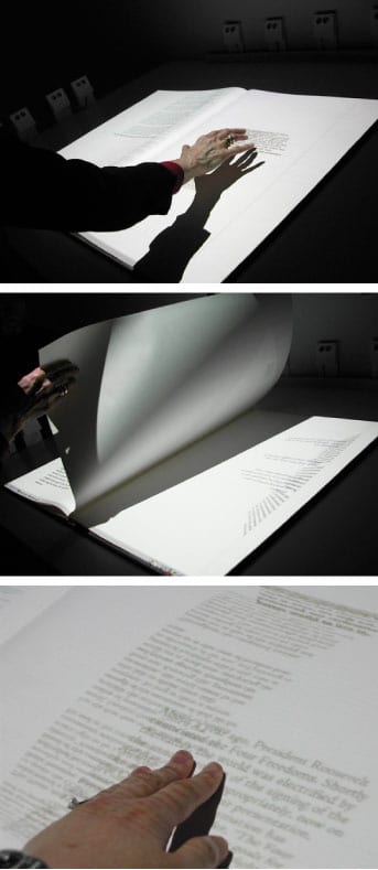
‘A commissioned work for Documenta11 in Kassel, Germany, the Illuminated Manuscript explores the communicative possibilities of spatialized language in the electronic media. Combining physical interfaces with purely typographical information in a virtual environment, this piece explored new types of reading in tune with human perceptual abilities.
A handbound book is set in a spartan room. Projected typography is virtually printed into the blank pages with a video projector. Sensors embedded in the pages tell the computer as the pages are turned. In addition, sonar sensors allow visitors to run their hands over and to disrupt, combine and manipulate the text on each page. The book begins with an essay on the four freedoms – freedom of speech, freedom of religion, freedom from fear and freedom from want. Each page explores a different text on the topic of freedom.’
Source: http://www.davidsmall.com/portfolio/illuminated-manuscript
Fig.17 Illuminated Manuscript
The project makes navigating the text a tactile and intuitive activity. The metaphor of the book is likely to help situate the content in its original context. The work is innovative in its use of technology and seems to take a very creative approach to typographic detailing. It is more difficult to assess how the structure and sequencing of information help the user to make sense of the information – a simple question would be – why is the information ordered in this way and how is the user guided to make decisions? However using this visualisation is likely to be a very engaging sensory experience.
13. Talmud Project (David Small) –
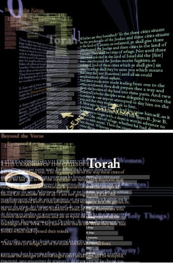
‘The Talmud Project, exhibited at the Cooper-Hewitt Museum’s first National Design Triennial, explores the simultaneous display of multiple related texts. Several dials allow the reader to trace ideas from one text to another, examine translations and find text in the larger context of the full corpus.’
Source: http://www.davidsmall.com/portfolio/talmud-project/
Fig.17 Talmud project
The notion of text in architectural space brings the user into spatially managing and organizing content. One imagines stacking and zooming through the z-dimension around this ‘city’ to explore the text content. The text translation and search functionality of the visualisation are powerful. It is difficult to assess how ‘clear’ the information is (or indeed needs to be) so that users can make decisions and progress through the content. It is aesthetically rich but perhaps could be said to be information poor (cognitive load of processing texts = very high) – however it can be imagined that the interactive functionality is novel and would help to keep users engaged in open ended exploration of the material.
14. Open Source Spying (Lisa Strausfeld)
http://pentagram.com/en/new/2006/12/new-work-the-new-york-times-ma.php
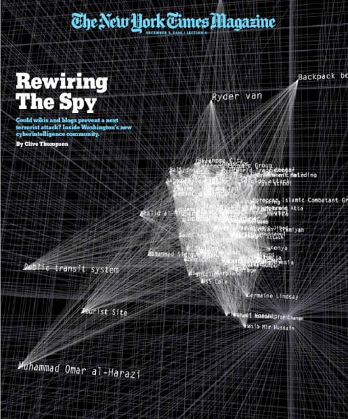
‘Lisa Strausfeld, with James Nick Sears, has designed the illustrations for the cover story of the December 3 issue of The New York Times Magazine. The piece, titled “Open-Source Spying,” is about whether blogs and wikis could be used by agencies like the C.I.A. and F.B.I. to combat terrorism. The visualisations create a three-dimensional space in which the physical relationship of actors, weapons and targets suggest their level of connection in an attack.’
http://pentagram.com/en/new/2006/12/new-work-the-new-york-times-ma.php
Fig.18 Open Source Spying
Similar in style to the visual thesaurus this work uses a simple network of nodes that show associated word content. The difference is that this approach has been applied to a specific database (of words associated with specific search terms). The effect is density of stacking that serves to partially conceal the information below, giving a strong impression of complexity. We can imagine that this is the intention in the printed form of the visualisation for the cover. In the interactive form a better view of each node is gained through zooming and panning, where a clearer view of the words surrounding nodes can be seen.
15. Valence (Ben Fry)
http://benfry.com/valence/index.html
‘Valence is a set of software sketches about building representations that explore the structures and relationships inside very large sets of information.
I’m interested in building systems that create visual constructions from large bodies of information. The methods used in designing static chunks of data: charting, graphing, sorting and the rest (see the books by Tufte for the complete run-down) are well understood, but much interesting work remains in finding models and representations for examining dynamic sources of data, or very very large data sets. For this work, I’m employing behavioral methods and distributed systems which treat individual pieces of information as elements in an environment that produce a representation based on their interactions. Valence is a software experiment that addresses these issues.’
Source: valence http://benfry.com/valence/index.html
Fig.19 Valence
A very interesting distinction between content and interaction – where the nature of the content (for example the structure of language) is reflected in, or dictates in some way the visual form of the elements on screen. So, the form of the visualization could be rendered dynamically depending on the variables that are found within the text.
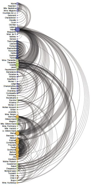
16. Arc diagrams
http://hci.stanford.edu/jheer/fi les/zoo/ex/networks/arc.html
‘An arc diagram… uses a one-dimensional layout of nodes, with circular arcs to represent links. Though an arc diagram may not convey the overall structure of the graph as effectively as a two-dimensional layout, with a good ordering of nodes it is easy to identify cliques and bridges. Further… multivariate data can easily be displayed alongside nodes.’ [10]
Fig.20 Arc Diagram
18. Hierarchies – some useful practical examples
Heer et. al. categorize a number of visualisation techniques under the term ‘hierarchies’.
‘While some data is simply a flat collection of numbers, most can be organized into natural hierarchies. Consider: spatial entities, such as counties, states, and countries; command structures for businesses and governments; software packages and phylogenetic trees. Even for data with no apparent hierarchy, statistical methods (for example, k-means clustering) may be applied to organize data empirically.’ [10]
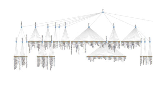
— Node link diagram
‘Node-link diagrams. The word tree is used interchangeably with hierarchy, as the fractal branches of an oak might mirror the nesting of data. If we take a two-dimensional blueprint of a tree, we have a popular choice for visualising hierarchies: a node-link diagram. Many different tree-layout algorithms have been designed; the Reingold-Tilford algorithm, used in Figure 4a on a package hierarchy of software classes, produces a tidy result with minimal wasted space.’ [10]
Fig.21 Node link diagram
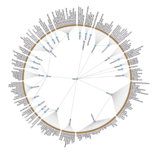
— Radial cluster diagram
‘An alternative visualisation scheme is the dendrogram (or cluster) algorithm, which places leaf nodes of the tree at the same level. Thus, in the diagram [above] the classes (orange leaf nodes) are on the diameter of the circle, with the packages (blue internal nodes) inside. Using polar rather than Cartesian coordinates has a pleasing aesthetic, while using space more efficiently.’ [10]
— Indented tree diagram
‘We would be remiss to overlook the indented tree, used ubiquitously by operating systems to represent file
directories, among other applications (see Figure 4c). Although the indented tree requires excessive vertical space
and does not facilitate multiscale inferences, it does allow efficient interactive exploration of the tree to find a specific node. In addition, it allows rapid scanning of node labels, and multivariate data such as file size can be displayed
adjacent to the hierarchy.’ [10]
Fig.23 Indented tree diagram
— Adjacency diagram
‘The adjacency diagram is a space-filling variant of the node-link diagram; rather than drawing a link between parent and child in the hierarchy, nodes are drawn as solid areas (either arcs or bars), and their placement relative to adjacent nodes reveals their position in the hierarchy. The icicle layout [left] is similar to the first node-link diagram in that the root node appears at the top, with child nodes underneath. Because the
nodes are now space-filling, however, we can use a length encoding for the size of software classes and packages. This reveals an additional dimension that would be difficult to show in a node-link diagram.’ [10]
Fig.24 Adjacency diagram
— Enclosure diagram
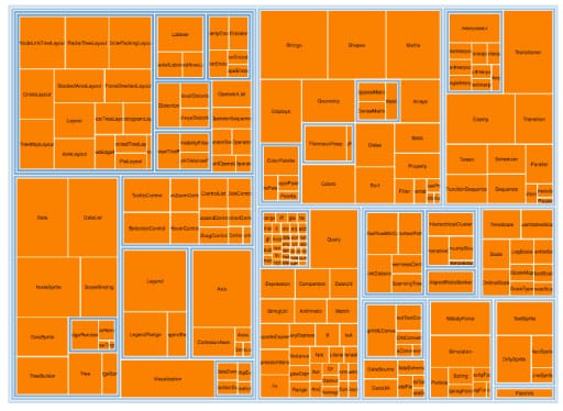
‘The enclosure diagram is also space filling, using containment rather than adjacency to represent the hierarchy. Introduced by Ben Shneiderman in 1991, a treemap recursively subdivides area into rectangles. As with adjacency diagrams, the size of any node in the tree is quickly revealed. The example shown in Figure 4f uses padding (in blue) to emphasize enclosure; an alternative saturation encoding is sometimes used.’ [10]
Fig.25 Enclosure diagram
— Pack diagram
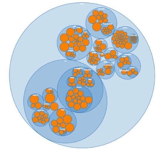
‘By packing circles instead of subdividing rectangles, we can produce a different sort of enclosure diagram that has an almost organic appearance. Although it does not use space as efficiently as a treemap, the “wasted space” of the circle-packing layout, shown in Figure 4g, effectively reveals the hierarchy. At the same time, node sizes can be rapidly compared using area judgments.’ [10]
Summary
‘Creating a visualisation requires a number of nuanced judgments. One must determine which questions to ask, identify the appropriate data, and select effective visual encodings to map data values to graphical features such as position, size, shape, and color. The challenge is that for any given data set the number of visual encodings—and thus the space of possible visualisation designs—is extremely large.’ [10]
A ‘top slice’ of some novel network visualisations have been considered in this practice review. Each has its own particular application for visualising certain types of information in particular contexts. Key factors in adopting a visualisation method must certainly be the nature of the data and the insight likely to be gained through it, the technical and perceptual abilities of the audience/user, the capacity and resources of the designer(s) and the context of visualisation production and use.
We should keep asking how design methods will evolve given the changing nature of all these factors. Given the exponentially increasing amounts of data available it seems there is an increasing need to curate/edit/distill them into understandable stories, quickly and in diverse environments. Hence the need for design and research.
References
1. The Eyes Have It: A Task by Data Type Taxonomy for Information Visualisations
2. Steele, J and Iliinsky, N (2011:5), Designing Data Visualisations: Representing Informational Relationships (2011), O’Reilly
3. Tufte, (2001) The Visual Display of Quantitative Information, Graphics Press
4. Judelman, G (2004) Aesthetics and Inspiration for Visualisation Design:
Bridging the Gap between Art and Science, Proc Eighth International Conference on Information Visualisation, London
5. Github explorer, http://lumberjaph.net/graph/2010/03/25/github-explorer.html, accessed 5.11.2011
6. Few, S (2009) Now You See It: Simple Visualisation Techniques for Quantitative Analysis, Analytics Press
7. Few, S, http://www.perceptualedge.com/blog/?p=1090, accessed 5.11.2011
8. Steinberger et. al (2011) Context-preserving visual links. Proc IEEE Trans Vis Comput Graph
9. Vande Moere, A (2008) Beyond the Tyranny of the Pixel: Exploring the Physicality of Information Visualisation, Information Visualisation, 2008. IV ‘08. 12th International Conference
10. Heer et. al. (2010) A Tour Through The Visualisation Zoo, Communications of the ACM, Vol. 53, No. 6
