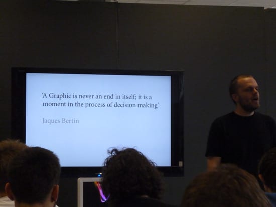
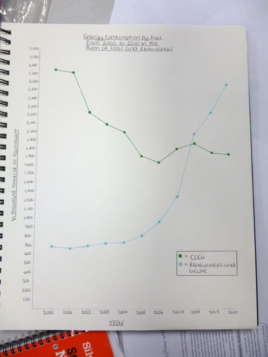
Today I will be giving a lecture to my second year BA (Hons) Graphic Design students – an introduction to design for data visualisation. We will be doing some practical exercises first on graphing techniques for quantitative data.
This is an exciting time because it is the first occasion where we have looked at this area of design on the course. The general idea is that we’ll be considering data visualisation in terms of clarity of content and being data-led, and so will be practicing and debating some key principles (Stephen Few’s principles of graph design, Tufte’s principle of data to ink ratio). Following on from that we’ll be turning later to the aesthetic quality of data visualisation designs and how this impacts on the communication, which no doubt will raise the classic form vs function / style vs content design debate. We’re starting with the idea of data being grouped into three categories (quantities, relationships and spatial) which is slightly unorthodox for the purists out there, but will hopefully be a good way of introducing design for visualising data to a fresh audience. Here’s a sneak peek at the beginning part of today’s lecture:
_
_


