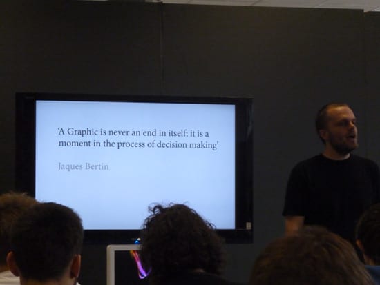
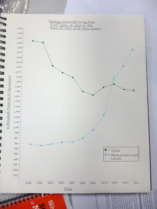
One of the biggest differences of opinion in the data/information visualisation design community arises from the form versus function debate – specifically what a visualisation should look like (its style) versus what it should facilitate (its utility). This pre-occupation seems to have formed two ‘sides’ in the visualisation community. It tends to yield healthy and intense debate (e.g. here, here, here and here) whilst serving as fertile ground for creative practitioners (e.g. here, here and here). But the general contention seems polarised and a little tired – where concerns to either reconcile or celebrate differences between aesthetic and utility centric visualisation design leads to a sense of paralysis preventing design and research from moving forwards. At its root – is the comparability of practices invoked in the argument (namely between ‘infographics’ and data visualisation) justifiable?
It’s a very neat summary about differences between infographics and visualisations by Robert Kasara over at Eager Eyes:
‘Visualization is general, infographics are specific. Visualization is context-free, infographics are context-sensitive. Visualization is (largely) automatic, infographics are hand-crafted.’ Robert Kasara
And there are two even more fundamental distinctions to be made. Infographics are primarily for pointed communication around a small amount of data to non expert audiences and, generally, are manually labour intensive to produce. Whereas data visualisations are primarily for an exploration of large amounts of unstructured data, more often for analysts and subject experts, and tend to be produced by machine automation. So when both infographics and data visualisation are invoked in an argument about their style vs their utility value, it’s more realistic to acknowledge that infographics and data visualisations have different purposes, users and use contexts that makes a universal set of design principles hard if not impossible to define here. What this really suggests is a clear difference in the ‘needs’ that visualisations are filling and ultimately to a need for differing and more nuanced design principles.
Coming from very different ends of visualisation design practice, these quotes from Stephen Few (a proponent of functionality and clarity in design for Business Intelligence visualization) and Alberto Cairo (an information graphic designer and journalist) are perhaps good examples where reflective practitioners are considering tensions of style vs utility in their design work:
‘I am making a distinction between visual beauty as a goal in and of itself, which is not useful in a visualisation, and pleasing aesthetic qualities that contribute to a visualisation’s ability to communicate, which is what I teach and attempt to inspire.’ Stephen Few
‘Calling infographics just art makes people think that the priority when creating an infographic is to make it look beautiful. This is not a priority, but it’s important. Infographics have to be beautiful and have to be attractive, but that’s not a priority. The priority is to make them functional, to communicate something. I tried to fight that idea for a while, but I gave up, because this idea is rooted in the culture. Then I agreed to call infographics art, but proposed that it should be called “functional art”. First of all, it needs to be functional, and then it can be art.’ Alberto Cairo
For the sake of developing design practice it seems that (between the ‘two sides’ of visualisation design) there is a commonality in trying to reconcile form and functionality with regard to specific audiences and contexts of visualisation deployment. But all of this seems to be very designer centric. We should also be asking what people themselves bring into and do whilst they are decoding visual representations of data; whether that be in infographic or data visualisation form. What design principles are informing visualisation work that account for specifics of audience, motivation and context of use – and what knowledge and competences do designers have in curating and visualising data given such variables? The answer would lead to a greater understanding of the variety of visualisation use and lead to developing design methods accordingly.
If this could mark a point of departure in what seems to be too binary a debate – then it points to richer and more interesting ground in which we can hope to extend knowledge of design practice for info/data visualisation. For whilst accuracy and clarity are likely to be crucial in visualisations that are efficiency critical and for use by experts, equally important may be aesthetic appeal, play and the ‘guided’ experience that are the hallmark of casual and non specialist visualisation. Both are different, with different design principles and methods.
Chris.


